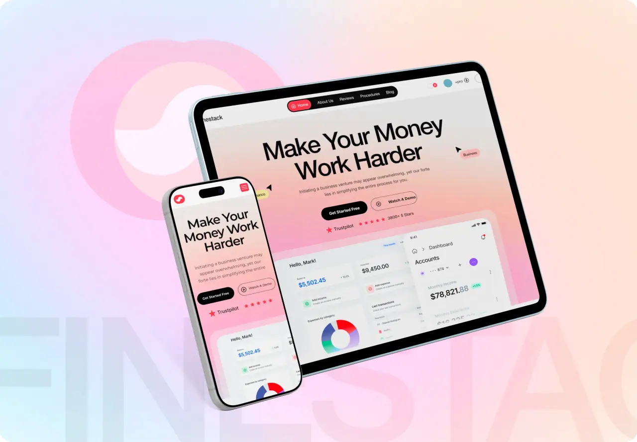





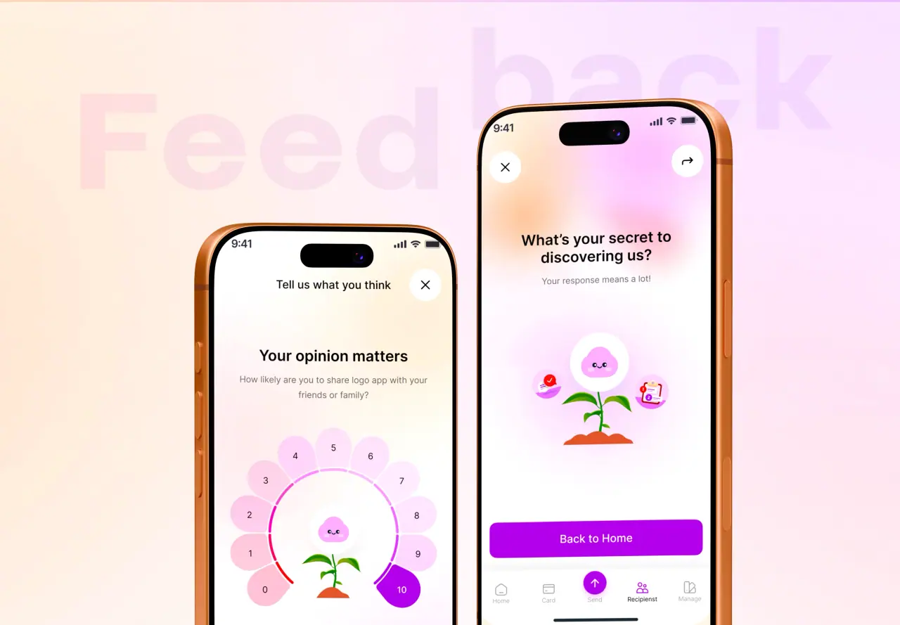
Mobile-first and desktop-first are two opposite ways to start a responsive design, and the order you choose shapes the whole product. This guide gives you a clear, unbiased answer on which approach fits your audience.
Key takeaways
- Mobile-first starts from the smallest screen and progressively adds for larger ones.
- Desktop-first starts rich and strips down, which risks a cramped mobile experience.
- Mobile-first forces content prioritization and usually yields faster, leaner pages.
- Desktop-first can fit data-dense tools where most real work happens on large screens.
The Short Answer
For most websites and consumer products, mobile-first is the better default. Starting from the smallest screen forces you to prioritize the essential content and actions, and you enhance from there for tablets and desktops. Since most web traffic in the US is mobile, this also tends to produce faster, leaner pages.
Desktop-first still has a place for data-dense internal tools, dashboards, and complex admin panels where the primary users sit at large screens. The nuance is that desktop-first often makes the mobile version harder, because you are removing rather than adding, and important things can get squeezed out.
- Mobile-first for most public sites and consumer apps
- Desktop-first for data-dense internal tools
- Mobile-first tends to force cleaner priorities
Where Each Option Wins
Mobile-first wins on focus and performance. A small canvas has no room for clutter, so you decide what truly matters first, then layer on enhancements for bigger screens. This progressive approach usually ships less code to phones, which improves load time and Core Web Vitals where most visitors are.
Desktop-first wins when the core experience genuinely lives on large screens. Complex dashboards, spreadsheets, and design tools benefit from being composed at full width first, where dense information and multi-panel layouts are natural. The catch is that adapting all that richness down to mobile takes deliberate, careful work.
- Mobile-first: forced focus and faster pages
- Desktop-first: natural for dense, multi-panel tools
- Mobile-first suits mobile-majority audiences
Side-by-Side Comparison
The table lines up the two approaches on the factors that shape a responsive build, from workflow direction to performance and content priority.
Read it against who your users are and where they actually work. A mobile-majority public audience leans one way; power users on large screens lean the other.
- Weigh workflow direction against your audience
- Factor in performance and content priority
- Consider where the core work really happens
| Factor | Mobile-First | Desktop-First |
|---|---|---|
| Starting point | Smallest screen, scale up | Largest screen, scale down |
| Content priority | Forced early and ruthless | Easy to overload, then trim |
| Performance | Usually leaner on phones | Risk of heavy mobile payloads |
| Layout complexity | Simple base, added richness | Rich base, careful reduction |
| Mobile experience | First-class by design | Often an afterthought |
| Best for | Public sites, consumer apps | Dashboards and internal tools |
| Common risk | Underserving power users | Cramped, cut-down mobile |
How to Choose
Choose mobile-first when your audience is mostly on phones, when the product is a marketing site or consumer app, or when performance and reach matter. Choose desktop-first when you are building a data-dense tool used primarily at a desk, where the full-width experience is the product and mobile is a secondary convenience.
The most common mistake is picking desktop-first out of habit and then bolting on a poor mobile version. Check your analytics first: if the majority of visits are mobile, designing for desktop first almost always leaves those users with a worse experience. Whichever you pick, design both ends deliberately rather than letting one be an accident.
- Mobile-majority public audience: mobile-first
- Desk-bound power users on dense tools: desktop-first
- Check analytics before defaulting to desktop

How NeoDimensional Helps
NeoDimensional is a US-based UI/UX design and software development agency, founded by Guljar Hosen. We look at your real audience data, then design and build a responsive experience that puts the right approach first, so both phone and desktop users get a layout made on purpose rather than by default.
If you are unsure whether to lead with mobile or desktop, book a 30-minute call and we will review your users and goals together.
- Responsive strategy based on your audience data
- Intentional design for both phone and desktop
- US-based UI/UX and front-end team