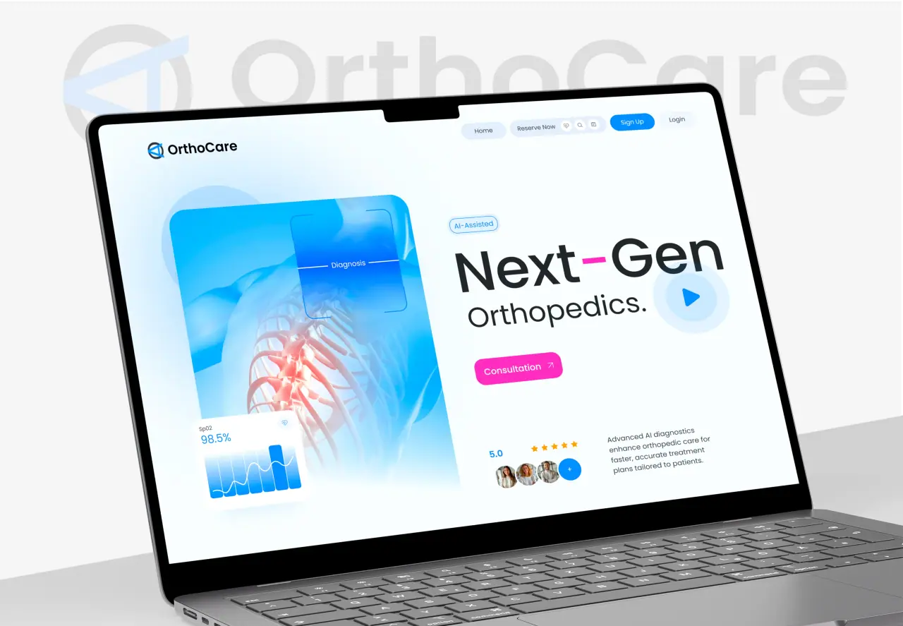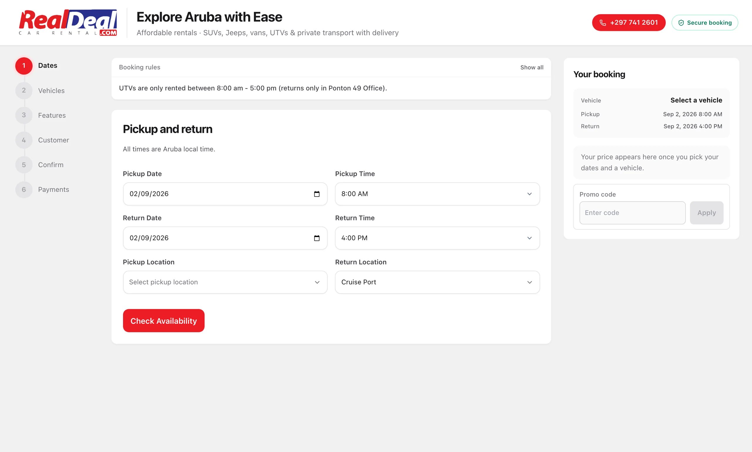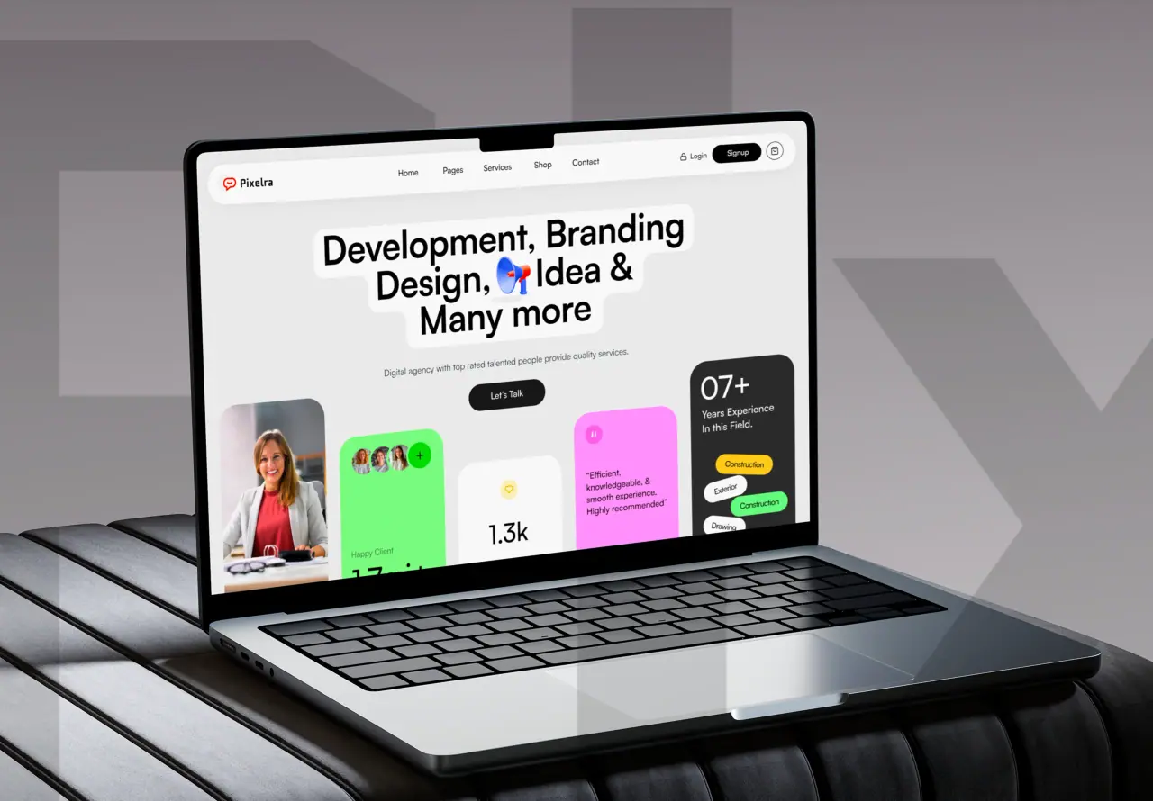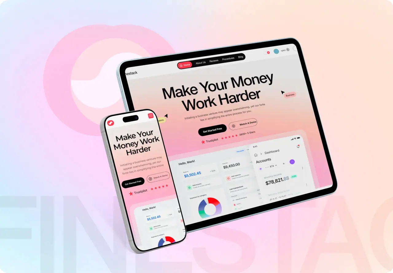





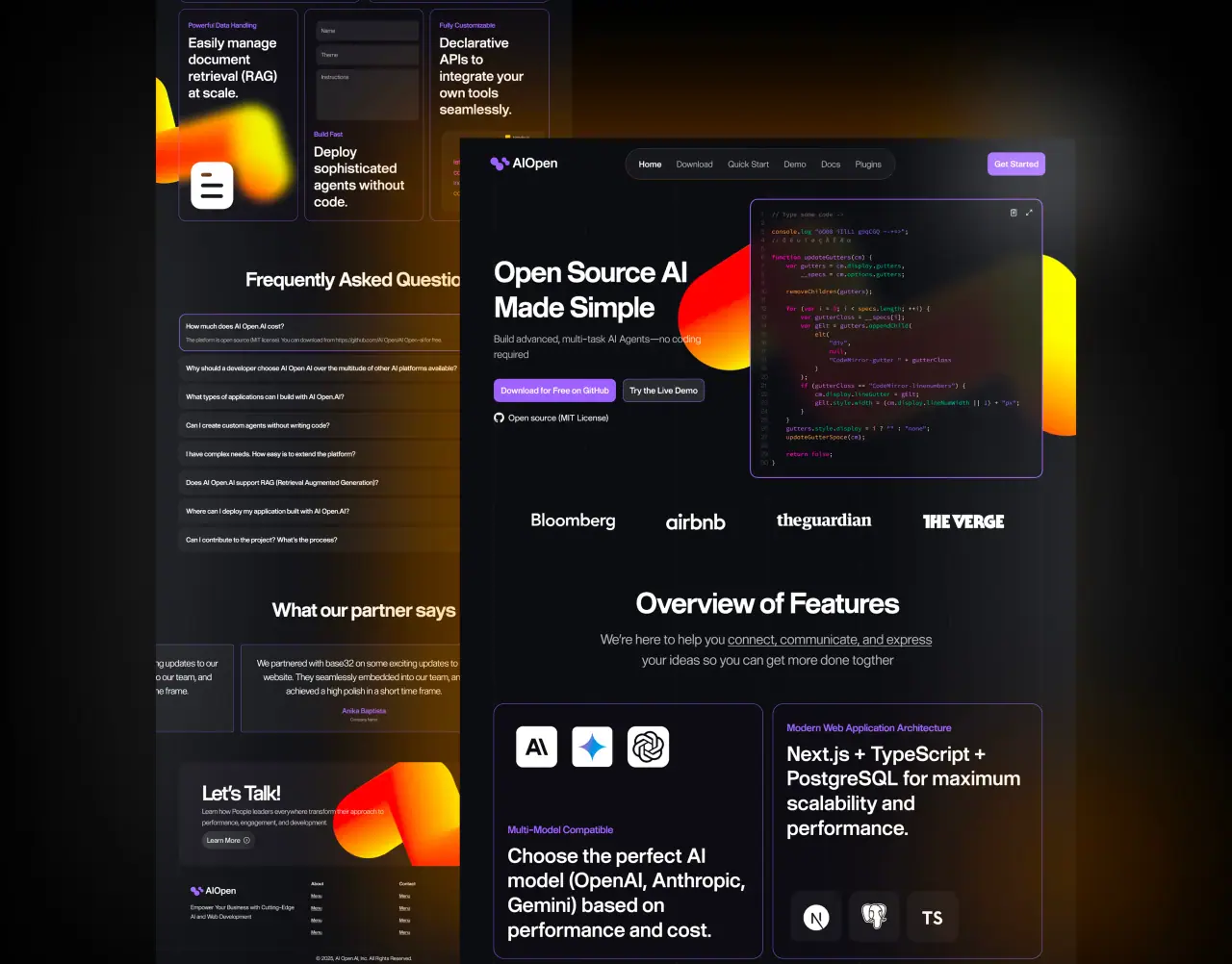
Wireframe, mockup and prototype compared side by side: what each one is for, how much detail it carries, how long it takes, who should see it, and when you can safely skip one.
Key takeaways
- A wireframe decides structure, a mockup decides the look, a prototype tests how it works.
- Each is cheaper to change than the next, so decide the big things early.
- Skipping a stage saves days only when the question it answers is already settled.
- Show wireframes to the team and prototypes to users.
The three side by side
The three artifacts answer different questions at different costs. The table compares them on the points that matter when you plan a project.
| Wireframe | Mockup | Prototype | |
|---|---|---|---|
| Question it answers | What goes where? | What does it look like? | How does it work? |
| Detail | Grey boxes and labels | Final visual design | Clickable, sometimes realistic |
| Typical time | Hours to days | Days | Days to a week or two |
| Show it to | Your team | Stakeholders | Real users |
| Cost to change | Minutes | Hours | Hours to days |
Wireframes decide structure
A wireframe strips away color, imagery and style so everyone can focus on what belongs on the screen and in what order. It is where you decide that pricing sits above the fold, that sign-up needs three steps and not five, and that the dashboard leads with the one number users check first.
Keep wireframes rough on purpose. Polish invites comments about fonts when the question on the table is whether the page has the right content.
Related: what a prototype is, in depth.
- Content and its order
- Navigation and flows
- Layout for phone and desktop
- No color, no imagery
Mockups decide the look
A mockup applies the brand to an agreed structure: typography, color, imagery, components and spacing. It is what stakeholders usually mean when they say they want to see the design, and it is the right moment for questions of taste and brand fit.
A good mockup includes the unglamorous states, such as empty screens, errors and loading, not only the perfect screen with ideal data.
Prototypes test how it works
A prototype links screens so someone can click through a task. Low-fidelity prototypes built from wireframes test flows early; high-fidelity prototypes built from mockups test the finished experience and show developers exactly how things should behave.
Put prototypes in front of real users. Five people attempting a task will reveal most of the problems a team has stopped seeing.
Related: UI/UX design from wireframe to handoff.
- Low fidelity: test flows early
- High fidelity: test the finished experience
- Put it in front of real users
- Shows developers how things behave
When you can skip a stage
Skip the wireframe when the structure is already proven, such as a new page that follows an existing template. Skip the high-fidelity mockup when a design system already defines the look and the screen only rearranges existing components. Skip the prototype for simple content pages with no task to test.
Do not skip a stage because of deadline pressure alone. Every question a skipped stage would have answered comes back later, in development, where it costs far more to fix.
| You can skip | When |
|---|---|
| Wireframe | The layout follows an existing, proven template |
| Mockup | A design system already defines every component used |
| Prototype | The page has no task or flow to test |
Common mistakes with each stage
Wireframes get polished too early, and the review turns into a discussion of colors. Mockups show only the perfect screen with ideal data, and the empty and error states are designed in a hurry during development. Prototypes get shown only to the team, who already know how everything works, instead of to users who do not.
The fix in each case is to keep each stage to its own question: structure, then look, then behavior, tested with the people it is meant for.
- Polishing wireframes too early
- Mockups with only ideal data
- Prototypes shown only to the team
- Mixing questions from different stages
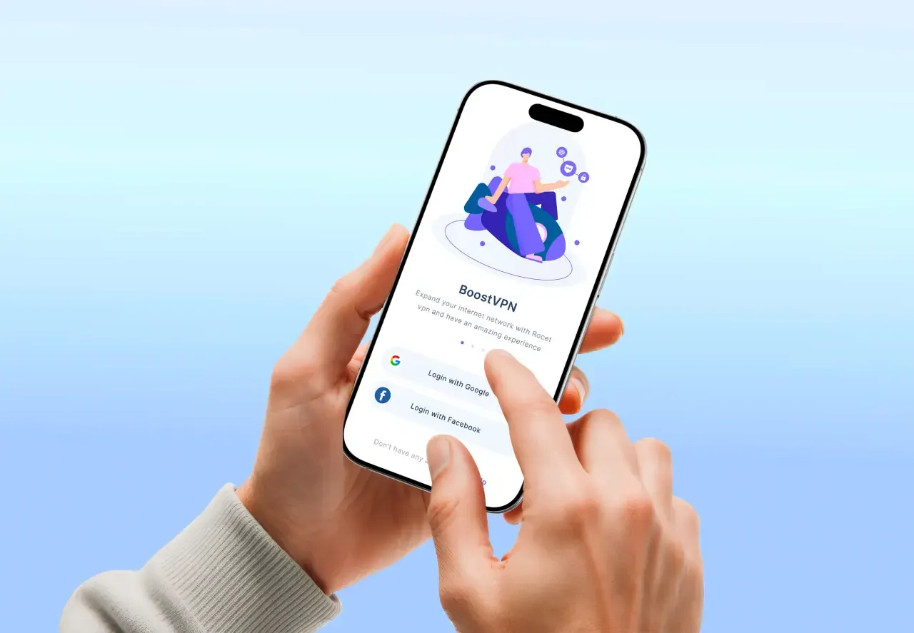
Tools for each stage
Most teams now do all three in Figma: rough frames for wireframes, the design system for mockups and linked frames for prototypes. Keeping everything in one file means a change to a component carries through every screen.
Paper sketches and whiteboards still earn their place for the very first wireframes, when speed matters more than precision.
What developers need from the final stage
Developers need more than pictures. They need the components and tokens from a design system, every state of every screen, spacing and behavior that is specified rather than guessed, and a prototype that shows how transitions and interactions should feel.
When the same team designs and builds, much of this travels in conversation rather than documents, which is why design-and-build teams tend to ship closer to the approved design.
How they fit in a real project
In a typical five-to-seven week UI/UX project with us, research takes about a week, wireframes and a clickable prototype one to two weeks, the high-fidelity mockups two to three weeks, and the design system and handoff about a week. You sign off each phase before the next begins.
For a deeper look at the prototype stage alone, our guide to what a prototype is covers the types and when to use each.