




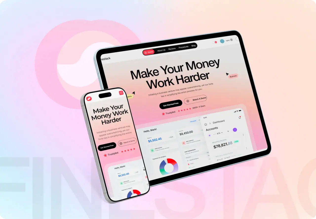
How to design a landing page in Figma, step by step: setting up the frame and grid, building sections with auto layout, making variants for testing, designing for phones first, and handing it to development.
Key takeaways
- Start from the message and the single action, then open Figma.
- Build every section with auto layout so the page resizes and reorders cleanly.
- Make headline and hero variants as components so testing ideas takes minutes.
- Design the phone version first; most paid traffic lands there.
Before you open Figma
Write down the traffic source, the promise, the audience and the one action. Draft the headline and the section order in plain text. A landing page designed before its message is clear ends up as a nice layout with nothing to say.
Collect the proof you will use, such as reviews, logos, numbers and screenshots, so the design reserves the right space for it.
- Traffic source and promise
- Audience in one sentence
- The single action
- Section order in plain text
- Proof: reviews, logos, numbers
Set up frames, grid and styles
Create a phone frame at 390 wide and a desktop frame at 1440. Add a layout grid: four columns on the phone, twelve on desktop, with consistent margins. Define text styles for headline, subhead, body and labels, and color variables for brand, text and backgrounds.
If you have a design system library, enable it now. Every button and input should come from a component, not be drawn by hand.
Build every section with auto layout
Treat each section as an auto layout frame with padding and gap set by variables. Nest auto layout inside it for rows and cards. The page can then grow with longer copy, and sections can be reordered by dragging without breaking spacing.
Use fill container for widths and hug contents for heights. It is what makes the same components work on the phone and desktop frames.
- One auto layout frame per section
- Padding and gaps from variables
- Fill container widths, hug content heights
- Sections reordered by drag, not rebuild
Make variants for testing
Turn the hero into a component with variants: two or three headlines, two images, a long and a short form. Swap them on the page in seconds to review options side by side, and give developers every version a test will need.
Keep the call-to-action button a single component so a change to its label or color carries through the whole page.
Related: landing page and product design.
Design the phone version first
Paid traffic mostly arrives on phones. Check that the headline, the promise and the button are visible without scrolling on a 390-wide frame, that the form fits without zooming, and that tap targets are big enough.
Then expand to desktop. It is far easier to add room than to squeeze a desktop layout into a phone.

Prototype, review and hand off
Link the buttons to a thank-you frame and put the prototype in front of a few people from the audience. Ask them what the page offers and what they would do next; if they cannot answer in five seconds, the hero needs work.
For handoff, mark the frames ready for development, annotate form behavior and tracking events, and export images at the right sizes. Developers inspect spacing and styles directly in Dev Mode.
| Handoff item | Why it matters |
|---|---|
| Frames marked ready for dev | Developers know what is final |
| Form fields and validation notes | Fewer questions during the build |
| Tracking events named | Conversions measured from day one |
| Images exported at real sizes | A fast page on phones |
When to bring in a team
Figma makes a landing page quick to design, but the conversions come from the message, the speed of the built page and the testing after launch. If you are spending real money on traffic, a team that writes, designs, builds and measures the page together usually pays for itself.
For the wider Figma workflow beyond one page, our guide to using Figma for UI/UX design covers libraries, variables and team files.