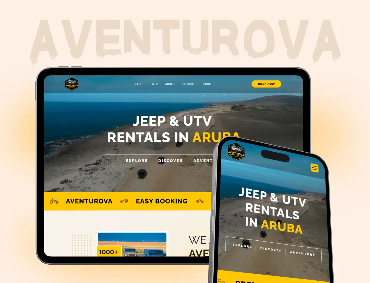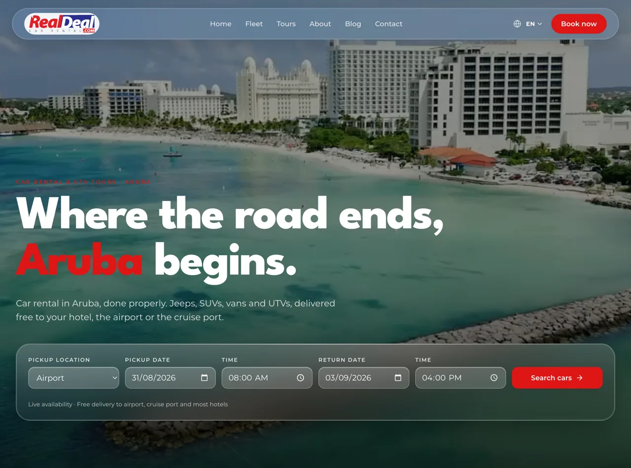






The call to action is where interest becomes action — or doesn’t. A weak one leaves conversions on the table. Here is how to write a great call to action that gets more people to click.
Key takeaways
- Be clear and action-oriented, not vague.
- Lead with the benefit, not the effort.
- Reduce friction and perceived risk.
- Make it stand out and easy to act on.
Be Clear and Action-Oriented
A great call to action tells people exactly what to do, starting with a verb: “Get,” “Start,” “Book,” “Download,” “Claim.” Avoid vague labels like “Submit” or “Click here” that don’t convey value or action. Clarity about what happens next removes hesitation and gets more clicks.
The visitor should never wonder what a button does or what they’ll get. A clear, action-oriented CTA answers that instantly and invites the click.
- Start with an action verb
- Avoid vague “Submit” / “Click here”
- Say exactly what happens next
Lead with the Benefit
The best CTAs emphasize what the visitor gets, not the effort required. “Get my free quote” beats “Fill out form”; “Start saving today” beats “Sign up.” Framing the action around the benefit makes clicking feel worthwhile and reduces the sense of work. People act when the payoff is clear.
Tie the CTA to the value the visitor came for. A benefit-led call to action turns a chore into an opportunity, and that lifts clicks.
- Emphasize the payoff, not the effort
- “Get my free quote” beats “Fill out form”
- Make clicking feel worthwhile
Reduce Friction and Risk
People hesitate when an action feels risky or effortful. Reduce both: use reassuring microcopy near the CTA (“Free, no obligation,” “Takes 30 seconds,” “No credit card required”), keep forms short, and make the commitment feel small. Lowering the perceived cost of clicking gets more people to do it.
A great CTA doesn’t just ask; it reassures. Removing friction and risk around the action is often what tips a hesitant visitor into converting.
- Reassuring microcopy near the CTA
- Short forms; small commitment
- Lower the perceived cost of clicking
Make It Stand Out
A great CTA has to be seen to be clicked. Use a button with a contrasting color that stands out from the page, give it room to breathe, size it prominently, and place it where the eye naturally lands — and repeat it at logical points on longer pages. Visual prominence is as important as the words.
The best-written CTA fails if it’s buried or blends in. Make it obvious and easy to find, and more visitors will take the action.
- Contrasting, prominent button
- Room to breathe; well-placed
- Repeat it on longer pages

How NeoDimensional Helps
NeoDimensional is a US-based web design and development agency, founded by Guljar Hosen. We design websites with clear, compelling, well-placed calls to action — the kind that turn more of your visitors into leads and customers.
Want a site that converts better? Book a 30-minute call and we’ll take a look.
- Clear, compelling CTAs
- Designed to convert
- More visitors take action