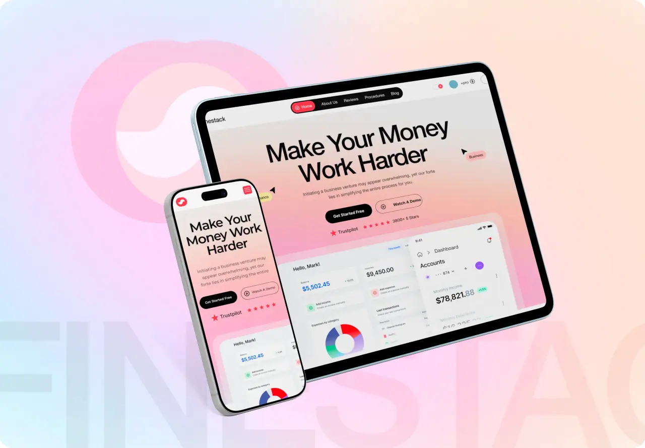






Most of your visitors are on a phone, yet many sites are still designed for desktop first and squeezed onto mobile as an afterthought. Mobile-first design flips that. Here is what it means and why it is the right default.
Key takeaways
- Mobile-first means designing the smallest screen first.
- It forces focus on what truly matters.
- It matches where most traffic actually is.
- It leads to clearer, faster experiences everywhere.
What Mobile-First Design Means
Mobile-first design means starting the design process with the smallest screen — the phone — and then progressively enhancing the experience for larger screens. It is the opposite of the old habit of designing a rich desktop layout and then trying to cram it onto mobile.
It is both a technical approach and a mindset. Technically, you build up from a mobile base; mentally, you commit to making the mobile experience excellent first, because that is where most people will meet your product.
- Design the phone experience first
- Enhance upward for larger screens
- A mindset as much as a method
Why It Produces Better Products
A small screen has no room for clutter, so mobile-first forces hard decisions about what truly matters. That discipline produces focused, clear experiences — and when you scale a focused design up to desktop, it stays clear, rather than the reverse where a busy desktop design becomes a mess on mobile.
It also aligns with reality and with SEO: most traffic is mobile, and Google indexes mobile-first, so a great mobile experience is where users are and what search rewards. Designing for it first is simply designing for the real world.
- Forces focus on what matters
- Clarity scales up better than clutter scales down
- Matches real traffic and mobile-first indexing
How the Approach Works
You start by designing the core experience for a narrow screen: essential content, a clear primary action, large touch targets, and simple navigation. Then, as the screen grows, you add refinement and secondary content — using the extra space to enhance, not to reintroduce clutter.
Throughout, performance and touch are first-class concerns: fast loads on mobile networks and interactions designed for fingers, not just cursors. Done well, every screen size gets an experience that feels made for it.
- Core experience first, refine as space grows
- Large touch targets and simple navigation
- Performance and touch treated as first-class
Common Misconceptions
Mobile-first does not mean mobile-only, or that desktop is neglected — it means desktop is built up from a solid mobile foundation and gets its own considered layout. It also does not mean stripping features; it means prioritizing them, so the most important ones lead.
Another myth is that it is harder or slower. In practice, starting simple and enhancing is often cleaner than starting complex and cutting. Mobile-first tends to produce better, more maintainable results, not more work.
- Mobile-first is not mobile-only
- Prioritize features, do not strip them
- Often cleaner, not harder
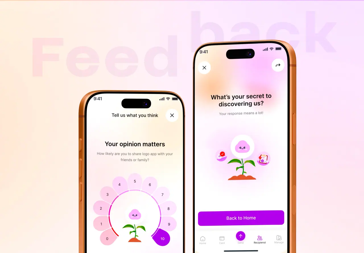
How NeoDimensional Designs Mobile-First
NeoDimensional is a US-based UI/UX design and web development agency, founded by Guljar Hosen. We design mobile-first by default — a focused, fast phone experience enhanced thoughtfully for larger screens — so your site works beautifully everywhere your customers are.
If your site struggles on mobile, or you are starting fresh, we can build it mobile-first. Book a call to talk it through.
- Focused, fast mobile experience first
- Thoughtfully enhanced for larger screens
- Great everywhere your customers are