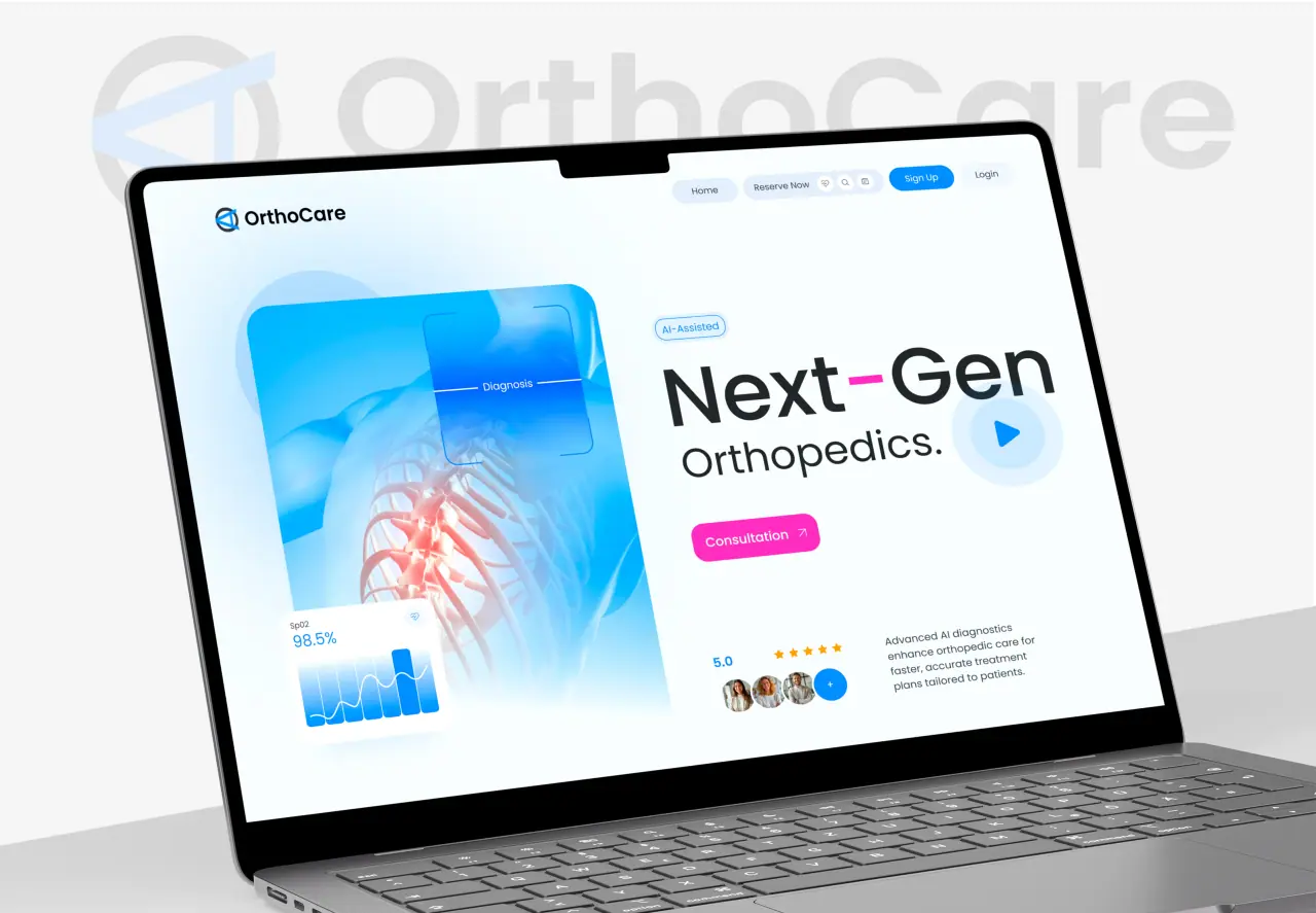





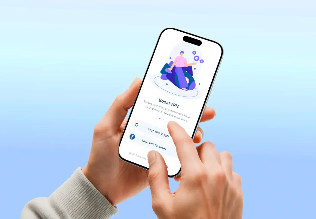
Most of your visitors are on a phone. Responsive web design makes sure your site works beautifully on every screen — and it directly affects conversion and search ranking. Here is what it is and how to get it right.
Key takeaways
- Responsive web design adapts a site to any screen size.
- It is essential for mobile users, conversion, and SEO.
- Great responsive design is mobile-first and content-driven.
- Performance and touch-friendly design are part of responsiveness.
What Responsive Web Design Is
Responsive web design is an approach where a single website adapts its layout to fit any screen — phone, tablet, laptop, or large monitor. Instead of separate mobile and desktop sites, flexible grids, images, and CSS breakpoints reflow the same content to look right everywhere.
The goal is one codebase that delivers a great experience on every device, so you never lose a visitor because your site was hard to use on their screen.
- One site that adapts to any screen
- Flexible grids, images, and breakpoints
- No separate mobile and desktop versions
Why Responsive Design Matters
The majority of web traffic is mobile, so a site that is awkward on a phone loses customers immediately. Responsive design also matters for SEO: Google uses mobile-first indexing, so how your site performs on mobile directly affects your ranking.
And it is efficient — one responsive site is cheaper to maintain than multiple versions, and it future-proofs you against new screen sizes.
- Most traffic is mobile — bad mobile UX loses customers
- Mobile-first indexing ties responsiveness to SEO
- One site is cheaper to maintain and future-proof
Principles of Great Responsive Design
Great responsive design starts mobile-first: design the smallest screen first, then enhance for larger ones. Content drives the layout, touch targets are large enough for fingers, and performance is treated as a feature so pages load fast on mobile networks.
Typography scales cleanly, images are optimized and sized for the device, and the most important content and calls to action stay visible without endless scrolling on small screens.
- Mobile-first, content-driven layouts
- Large touch targets and fast performance
- Optimized images and scalable typography
Common Mistakes to Avoid
The most common responsive mistakes are simply shrinking a desktop layout (tiny text, cramped buttons), heavy images that slow mobile load, and hiding important content or actions on small screens. Each one quietly costs conversions.
The fix is to design for mobile intentionally, test on real devices, and treat speed and touch usability as first-class requirements — not afterthoughts.
- Do not just shrink the desktop layout
- Optimize images so mobile loads fast
- Keep key content and actions visible on small screens
How NeoDimensional Builds Responsive Sites
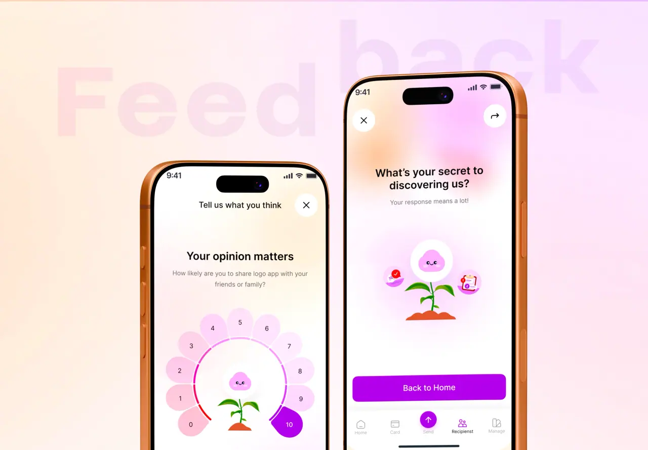
NeoDimensional is a US-based UI/UX design and web development agency, founded by Guljar Hosen. We design and build mobile-first, responsive websites that are fast, accessible, and look right on every device — engineered for both users and search engines.
If your site struggles on mobile or you are starting fresh, we can design and build a responsive experience that converts everywhere. Book a call to talk it through.
- Mobile-first, responsive design and build
- Fast, accessible, and SEO-ready
- Great on every device