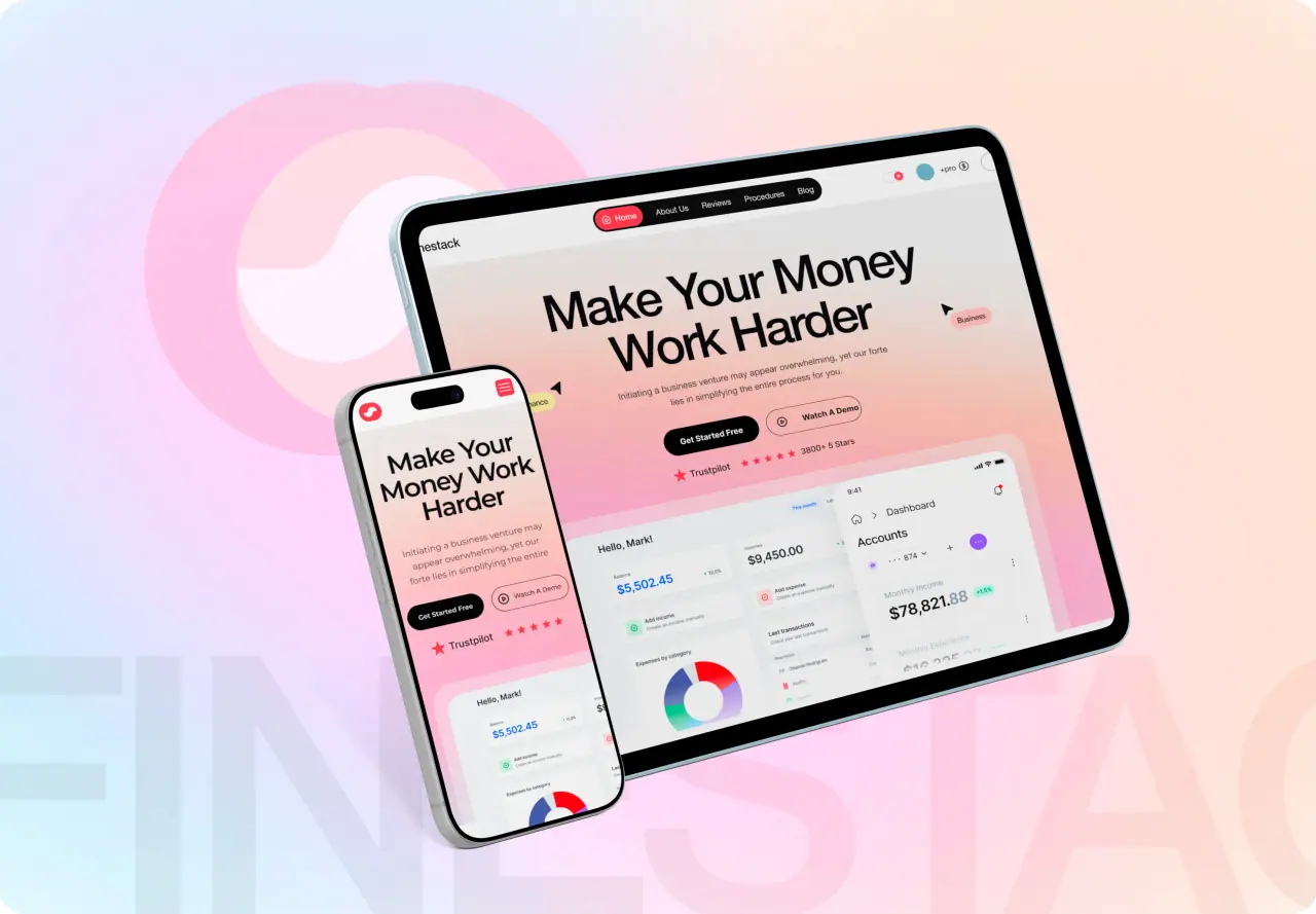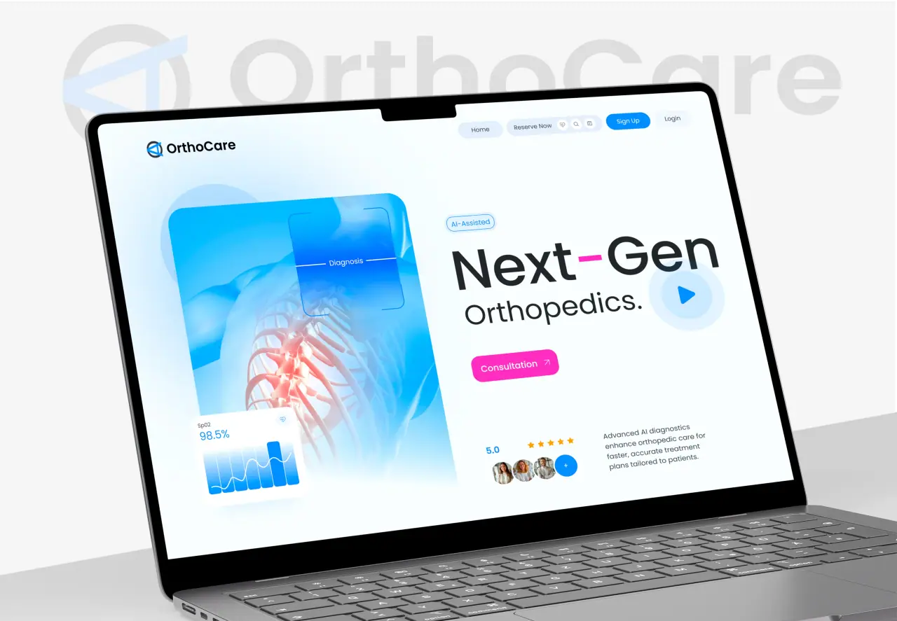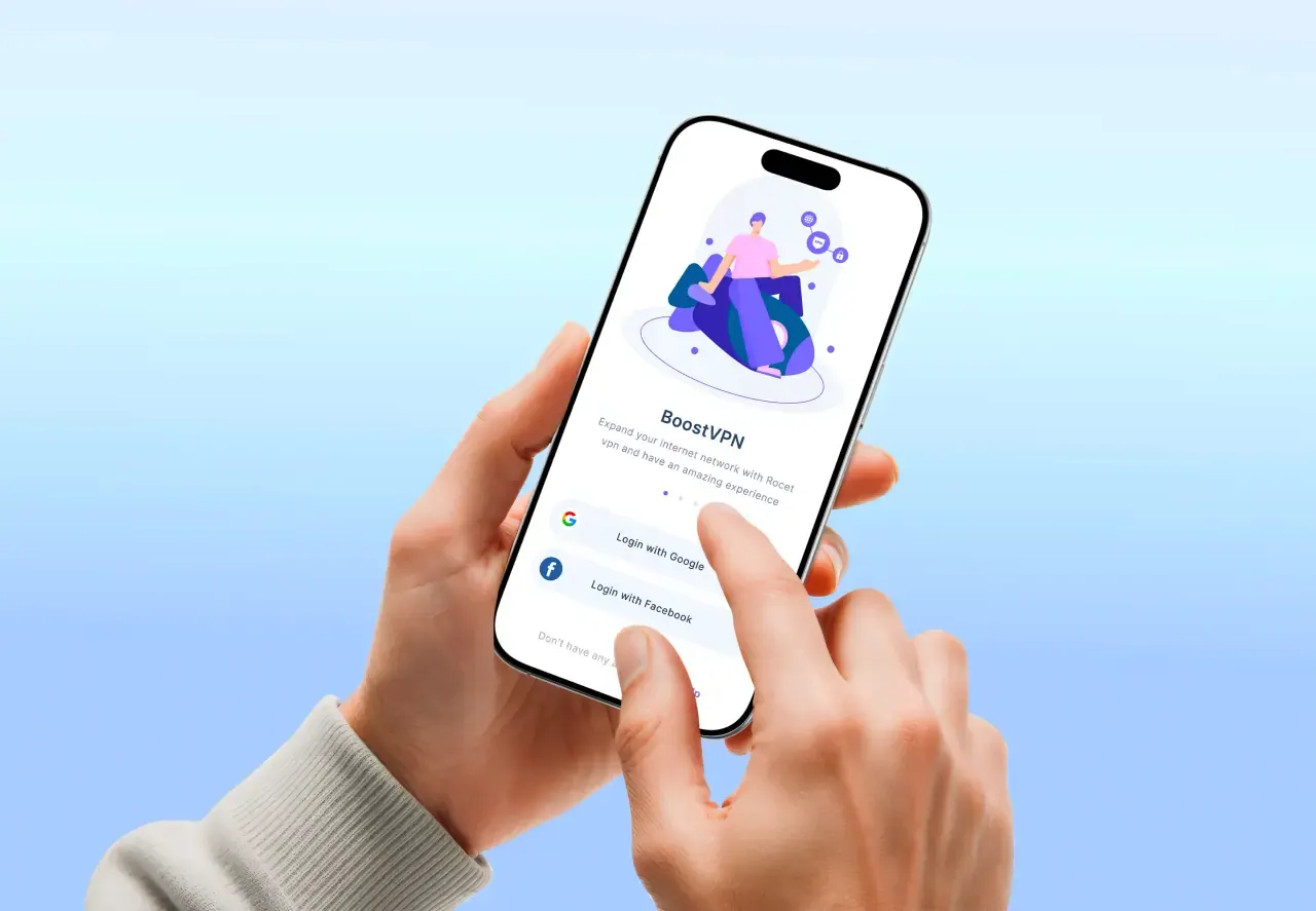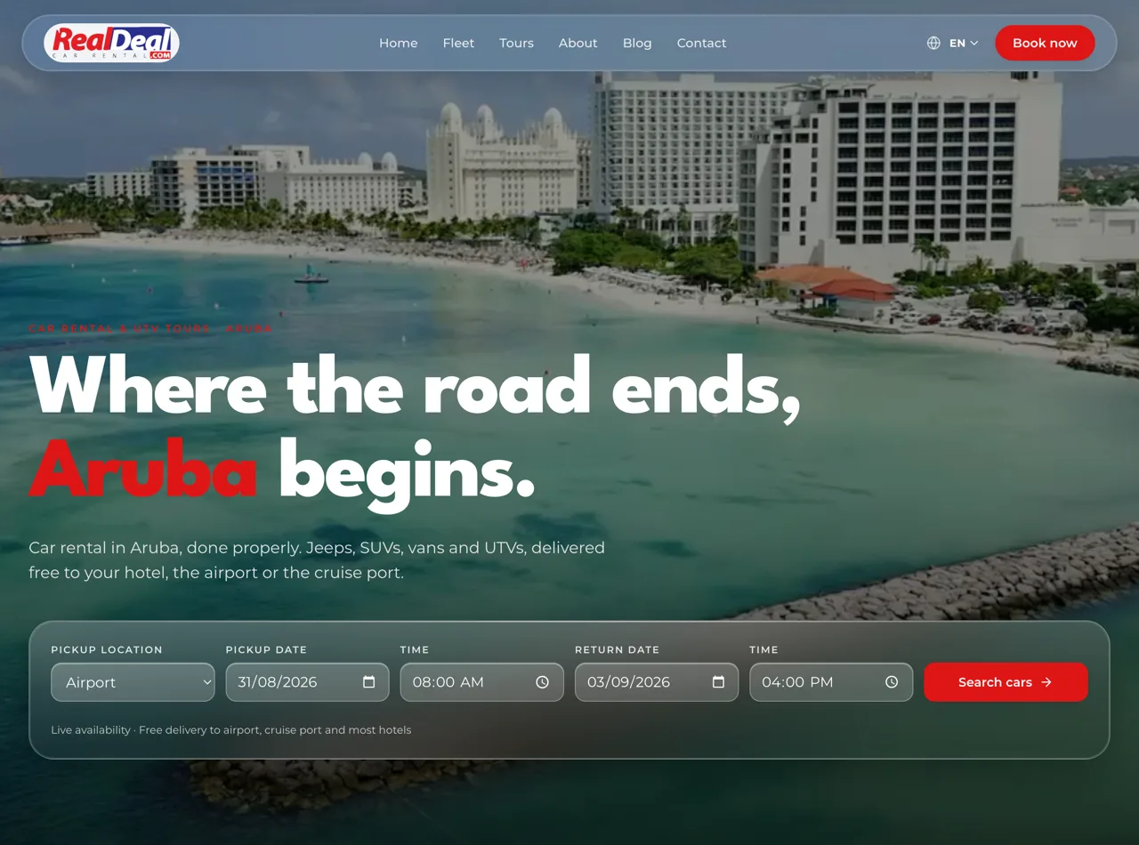





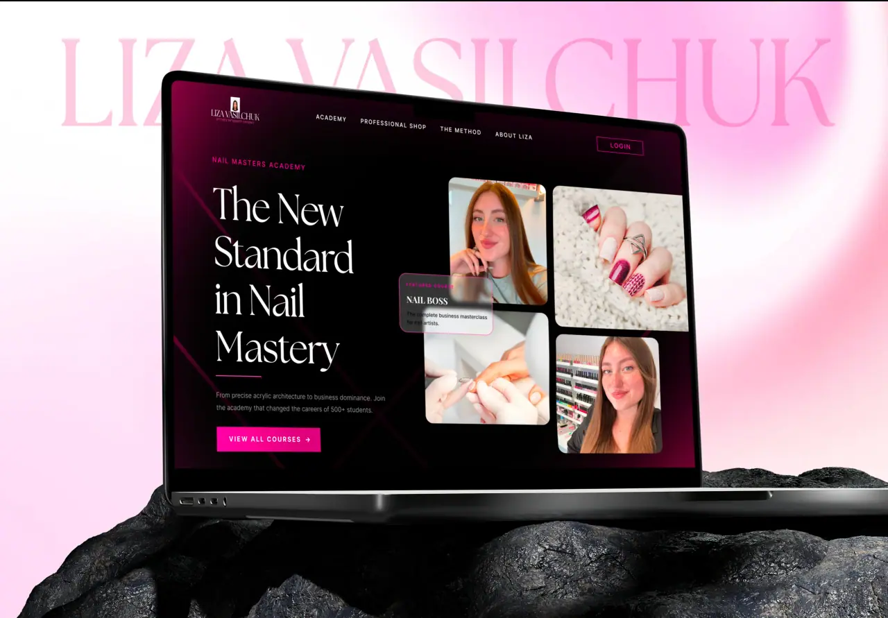
A landing page has one job: convert. Get it right and it turns clicks into customers; get it wrong and you pay for traffic that bounces. Here are the landing page best practices that actually move the needle.
Key takeaways
- A landing page should have one clear goal.
- The above-the-fold must communicate value instantly.
- Trust signals and clarity drive conversion.
- Remove every unnecessary bit of friction.
One Page, One Goal
The first rule of landing pages: focus. A landing page should have a single, clear goal — one primary action you want visitors to take, whether that is signing up, booking, or buying. Every element should support that action, and distractions (extra links, competing offers, unnecessary navigation) should be stripped away.
Pages that try to do several things convert worse than pages with one clear purpose. Decide the single action, and design the whole page to lead visitors toward it.
- One clear, primary action
- Every element supports it
- Strip out distractions
Nail the Above-the-Fold
The top of the page — what visitors see before scrolling — is decisive. In a few seconds it must communicate what you offer, who it is for, and why it matters, with a clear headline, a supporting line, and a visible call to action. If that first view is confusing, most visitors leave.
Treat the above-the-fold as the whole pitch in miniature. A strong one earns the scroll; a weak one loses the visitor before they ever see the rest of your page.
- Communicate the offer in seconds
- Clear headline, supporting line, visible CTA
- A weak first view loses visitors
Build Trust
People hesitate to act on pages they do not trust. Trust signals — testimonials, reviews, recognizable logos, guarantees, clear contact information, and professional design — reduce the perceived risk of taking your action. They often lift conversion more than changes to the offer itself.
Place trust elements near your calls to action, where doubt is highest. Reassuring visitors at the moment of decision is one of the most reliable ways to increase conversions.
- Testimonials, reviews, logos, guarantees
- Reduce the perceived risk of acting
- Place trust near the call to action
Remove Friction
Every extra step, field, or moment of hesitation costs conversions. Keep forms as short as possible, make the call to action obvious and repeated, ensure the page loads fast, and make it effortless on mobile. The easier you make acting, the more people will.
Audit your page for anything that slows a visitor down or raises a question — then cut or simplify it. Friction is where intent quietly dies, and removing it is often the highest-return improvement you can make.
- Short forms, obvious repeated CTA
- Fast loading, effortless on mobile
- Cut anything that slows the visitor
How NeoDimensional Designs Landing Pages
NeoDimensional is a US-based UI/UX design and web development agency, founded by Guljar Hosen. We design and build high-converting landing pages — focused on one goal, with a strong above-the-fold, real trust signals, and a frictionless path to action — and we can build them fast in Figma-to-code or Framer.
If you are running traffic to a page that is not converting, or launching a new offer, we can design one that performs. Book a call and we will look at your funnel.
- Focused, high-converting landing pages
- Strong above-the-fold, trust, low friction
- Built fast, designed to perform