






The words inside a product — button labels, error messages, empty states — shape how usable it feels as much as the visuals. That’s UX writing. Here is what it is and why it matters.
Key takeaways
- UX writing is the words inside an interface.
- Good microcopy guides, reassures, and reduces confusion.
- It’s part of design, not an afterthought.
- Clear words make products feel easier and more trustworthy.
What UX Writing Is
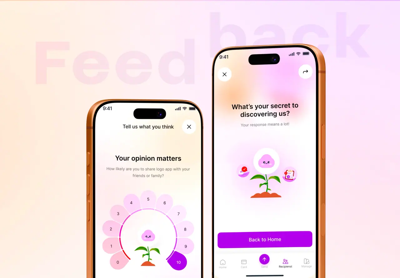
UX writing is the practice of crafting the words inside a product — button labels, menu items, form hints, error messages, empty states, and confirmations. This "microcopy" guides people through an interface and shapes how easy and trustworthy it feels.
It’s a real design discipline. The right word in the right place removes confusion; the wrong one creates it. Words are part of the interface, not decoration on top of it.
- The words inside an interface
- Labels, hints, errors, confirmations
- A design discipline, not decoration
Where It Shows Up
UX writing is everywhere you look in a product: the label on a button that tells you what will happen, the hint that helps you fill a form, the error message when something goes wrong, the empty state that invites you to start, the confirmation that reassures you it worked.
These moments are small individually but constant — and together they determine whether using the product feels clear and calm or confusing and stressful.
- Buttons, form hints, errors, empty states
- Small moments, everywhere
- They shape the whole feel
What Good UX Writing Does
Good UX writing reduces confusion, guides the next action, and reassures. A clear button label tells you exactly what will happen. A helpful error message explains what went wrong and how to fix it. Good empty states turn a blank screen into an invitation.
The result is a product that feels easier and more trustworthy — people accomplish their goals without friction or anxiety, often without noticing the words at all.
- Reduces confusion and guides action
- Reassures and explains
- Makes products feel easy and trustworthy
Principles of Clear Microcopy
Good microcopy is clear, concise, and human. It uses plain language over jargon, tells people what will happen or what to do, and matches the brand’s voice. Error messages say what went wrong and how to fix it — never just "Error."
The test is simple: does the word help the person, right where they are, do what they’re trying to do? If not, rewrite it.
- Clear, concise, and human
- Plain language over jargon
- Errors explain and help
How NeoDimensional Handles It
NeoDimensional is a US-based UI/UX design and software development agency, founded by Guljar Hosen. We treat the words in your product as part of the design — clear labels, helpful messages, and on-brand microcopy — so your product feels easy and trustworthy to use.
If your product’s copy is confusing or generic, we can fix it as part of the design. Book a call to talk it through.
- Words designed with the interface
- Clear labels, helpful messages
- Easy, trustworthy products