




Dashboard design best practices as a checklist: the layout, chart, color and interaction rules that make dashboards readable at a glance, with the common mistakes to avoid and a quick way to review your own.
Key takeaways
- Put the most important number top left and let everything else support it.
- Match each chart to one question; a bar chart answers most of them.
- Use color for meaning, not decoration, and never color alone.
- Show context with every number: compared with what, and is that good?
Lead with the most important number
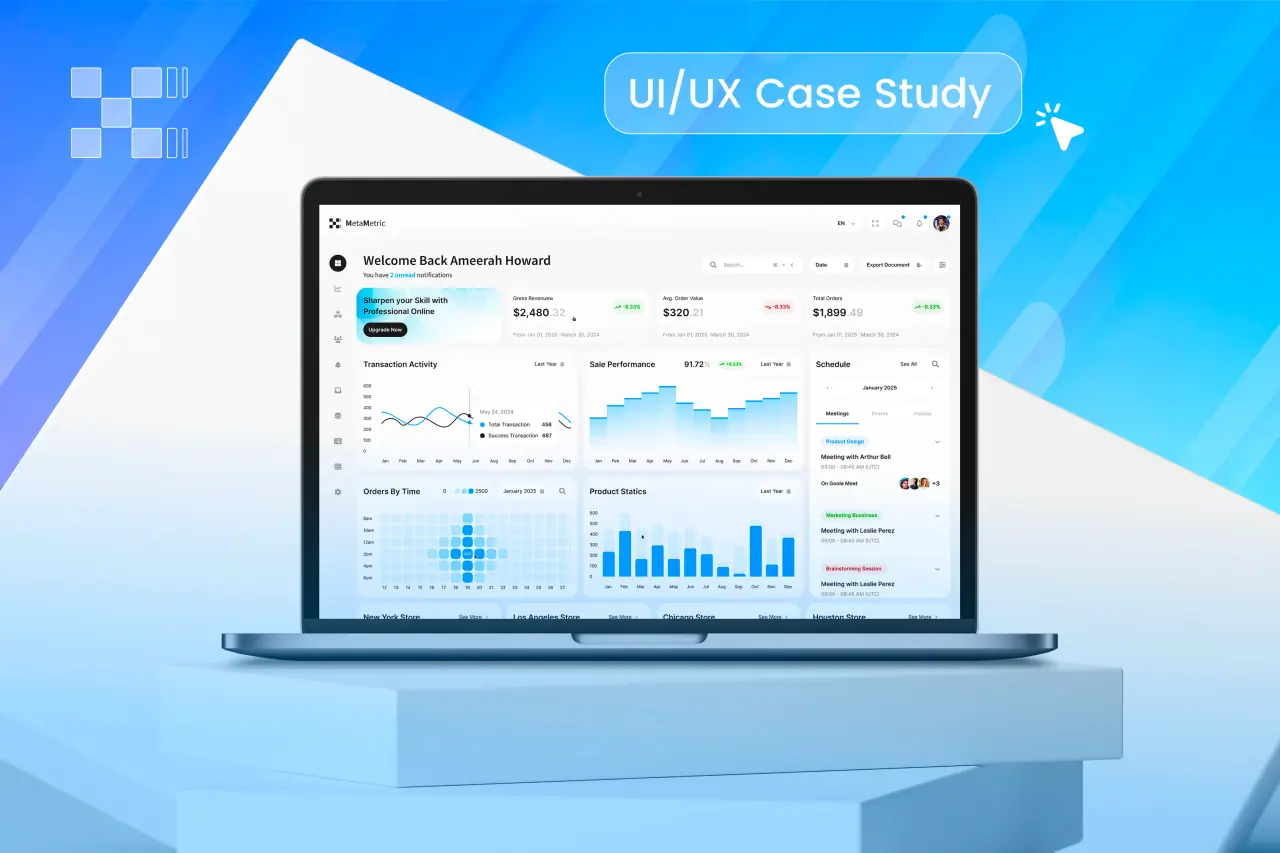
People read a dashboard in a pattern that starts top left. Put the one number that matters most there, large, with its comparison next to it. Secondary numbers follow, then the charts that explain them, then the detail tables.
If you cannot say which number matters most, the dashboard is trying to serve too many people. Split it by role before designing anything.
Give every number context
A number on its own means nothing. Show it against a target, the previous period or a benchmark, and say whether the change is good or bad. A small arrow and a percentage change next to each headline figure do most of this work.
Related: researching and designing a dashboard from scratch.
- Compared with the previous period
- Compared with a target
- Direction of change and whether it is good
- The time range, always visible
Choose charts by the question
Each chart should answer one question. The table maps common questions to the chart that answers them best.
| Question | Best chart | Avoid |
|---|---|---|
| How does it change over time? | Line chart | Many-series area charts |
| Which is bigger? | Bar chart, sorted | Pie with many slices |
| What share of the whole? | Stacked bar or a single donut | 3D pies |
| Is it on target? | Bullet chart or progress bar | Gauges that waste space |
| Where are the outliers? | Scatter plot or table | Dense heatmaps without labels |
Use color for meaning
Keep most of the dashboard neutral and reserve strong color for what needs attention: a metric off target, an alert, a selected filter. When everything is colored, nothing stands out.
Never rely on color alone. Pair red and green with arrows, labels or icons so color-blind users and anyone on a poor screen can still read the state.
Related: dashboard UI/UX design.
Control density
Show fewer things, better. A good rule is five to seven primary elements on the first screen. Move the rest behind tabs, filters or a drill-down so the main view stays readable.
Align everything to a grid, keep labels short, remove chart borders and heavy gridlines, and round numbers to the precision people actually use.
Filters, drill-downs and states
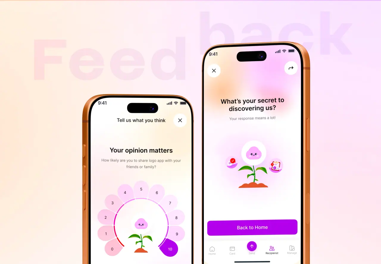
Put filters in one consistent place and show which are active. Let people click a number or chart to see the detail behind it. Design the states people forget: no data yet, data loading, an error from a source system, and a filter that returns nothing.
- Filters in one place, active ones visible
- Click through from summary to detail
- Empty, loading and error states designed
- Export where people need it
Common dashboard mistakes
Showing every metric someone asked for. Charts chosen for variety rather than for the question. Color used as decoration. Numbers without comparison. Tiny labels. No empty or error states. Each of these makes a dashboard harder to trust.
For how to research and design a dashboard from scratch around the people who use it, our guide to dashboard UI/UX design covers the process from interviews to testing.