




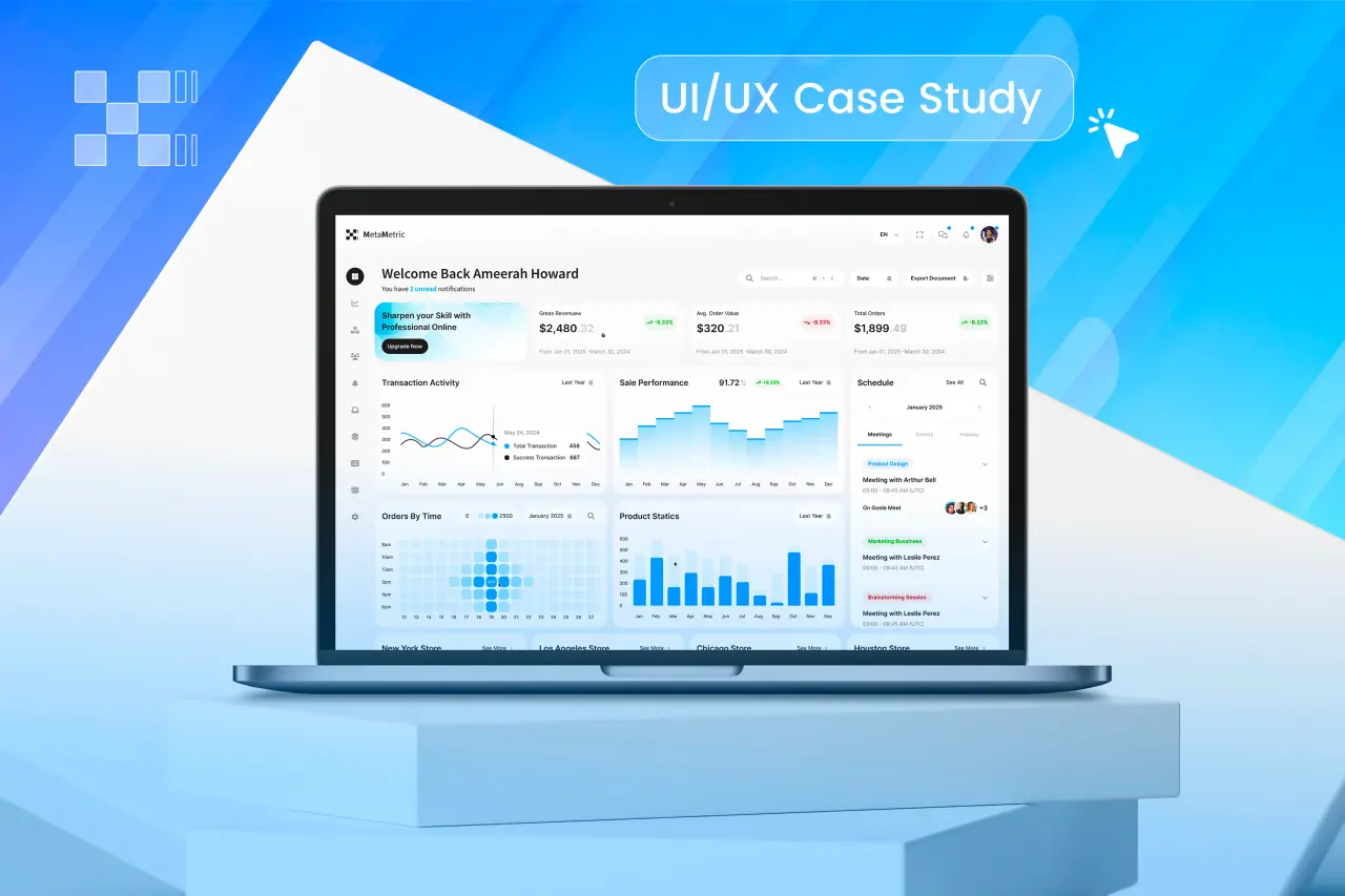
How to design a dashboard people actually use, from the UX side: researching the decisions it supports, mapping users and roles, prototyping with real data, testing, and designing for how it will change after launch.
Key takeaways
- Design around the decisions people make, not the data you happen to have.
- Different roles need different dashboards, not one screen that serves nobody.
- Prototype with real data early; fake numbers hide real problems.
- Watch how people use it after launch and keep improving it.
Start with decisions, not data
The most common reason dashboards go unused is that they show available data rather than answering a question someone has. Before any layout, interview the people who will use it and ask what they decide each day, each week and each month, and what they look at to decide.
Write each decision down with the numbers it needs. That list, not the database schema, is the brief for the dashboard.
- What do you decide daily, weekly, monthly?
- What do you look at to decide?
- What do you do when a number looks wrong?
- What do you currently export to a spreadsheet?
Map users and roles
An owner, a manager and an operator use the same data differently. The owner wants trends and totals, the manager wants exceptions and team performance, the operator wants today's list of things to act on.
Designing one dashboard for all three produces a screen that serves none of them. Design a view per role, sharing components and data, with permissions deciding who sees what.
Related: the dashboard design checklist.
| Role | Main question | What the view leads with |
|---|---|---|
| Owner | Are we on track? | Trends and totals against targets |
| Manager | Where do I need to step in? | Exceptions and team performance |
| Operator | What do I do next? | Today's actionable list |
Prototype with real data
Mock data is always tidy: round numbers, even distributions, no missing values. Real data has outliers, long names, gaps and zeroes that break layouts and charts. Use an export of real data in the prototype as early as possible.
Real data also exposes questions about the data itself, such as a metric defined two ways in two systems, which are far cheaper to resolve before development.
Test with the people who will use it
Give each tester a real task: find the region that missed its target last month, or decide which orders to chase today. Watch where they look first, what they misread, and what they try to click.
Five users per role will reveal most problems. Fix them in the prototype and test again before anything is built.
Related: custom dashboards and internal tools.
Design and engineering together
Dashboards depend on the data behind them: how fast queries return, how fresh the numbers are, which calculations run where. Designers and engineers need to work through these together, or the design promises a real-time view the data cannot deliver.
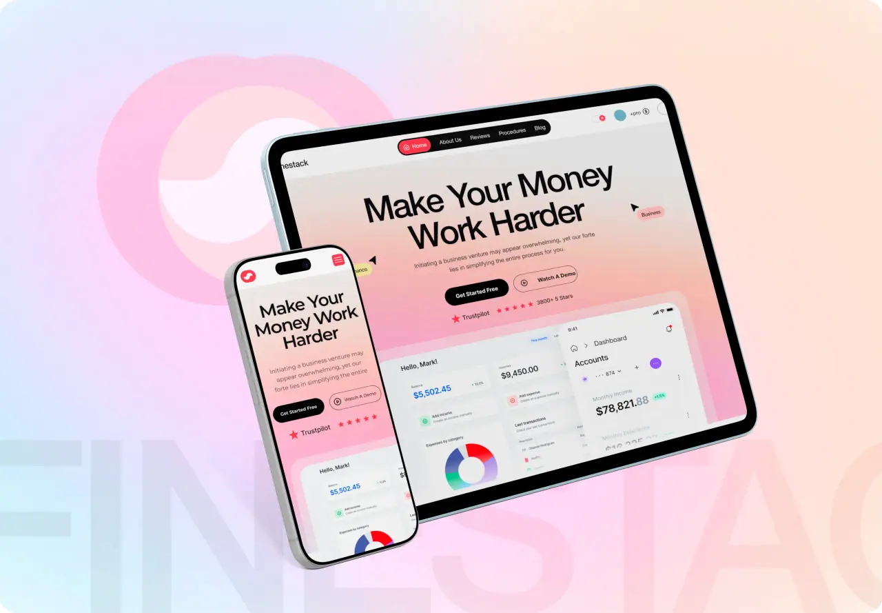
Our Metametric and Finestack case studies show what that looks like in practice, from the first interviews to the shipped screens.

Keep improving after launch
Add simple analytics to the dashboard itself: which views are opened, which filters are used, which exports are downloaded. Unused sections can go; heavily exported data is a sign that something is missing from the screen.
Schedule a review after a month with the people using it daily. Dashboards that improve after launch become trusted; ones that do not become a tab nobody opens.
The visual rules
Once the research and structure are right, the visual design follows well-known rules for hierarchy, chart choice, color and density. Our checklist of dashboard design best practices covers them. Custom software with dashboards starts at $4,999 with us, designed and built by one team.