




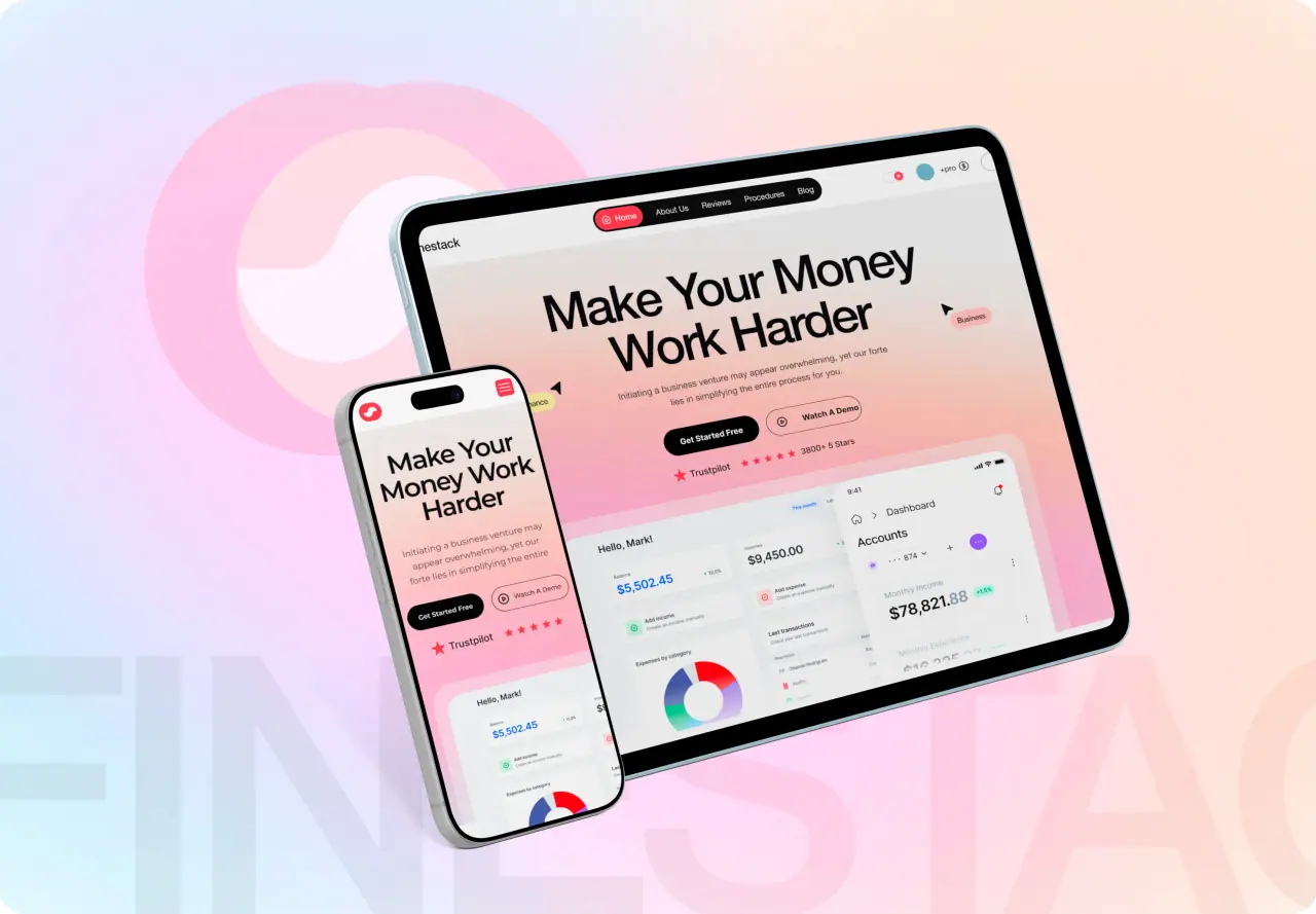
FineStack had powerful financial tooling wrapped in an overwhelming interface. We redesigned the experience and rebuilt the front end to make complex data feel simple — and the numbers followed.
Key takeaways
- In fintech, trust comes from clarity — dense screens erode confidence.
- A guided onboarding flow lifted completion and speed-to-value.
- A component-driven rebuild made the product fast and consistent.
- Design and engineering in one team kept the vision intact to launch.
The Challenge
FineStack offered serious financial functionality, but everything competed for attention at once. New users faced a wall of numbers with little guidance, and the density made a trustworthy product feel intimidating.
The business impact was measurable: strong interest at sign-up, but users stalled during onboarding and leaned heavily on support to get started. The mandate was to make complexity feel simple without dumbing the product down.
- Dense, undifferentiated data on first use
- Users stalled during onboarding
- High support load just to get started
Research and Discovery
We started with the people, not the pixels — mapping who used FineStack, what they were trying to accomplish, and exactly where they got stuck. Session reviews and support themes pointed to a clear culprit: no obvious first step.
That reframed the problem. FineStack did not need more features; it needed a hierarchy. The goal became getting every new user to one meaningful financial insight as quickly as possible.
Related: fintech software development.
- Mapped user goals and drop-off points
- Support themes revealed the biggest friction
- Reframed the goal around time-to-first-insight
The Redesign
We rebuilt the information hierarchy around a guided first-run experience: a focused onboarding flow, a dashboard that surfaces the few numbers that matter first, and progressive disclosure for depth once users are oriented.
Visual clarity did the rest — restrained color used to signal meaning, generous spacing, and consistent patterns so the product felt calm and credible. Complexity is still there; it is just no longer the first thing you see.
- Guided onboarding to a first meaningful insight
- Surface the vital few metrics, reveal depth on demand
- Calm, credible visual system for a fintech audience
Engineering the Rebuild
Because the same team designed and built, the rebuild used a component library mapped directly to the design system — every chart, table, and card a reusable, tested part. That kept the interface consistent and fast.
We prioritized performance and accessibility from the start: efficient data loading so the dashboard stays responsive under real financial data, and WCAG-aligned contrast and keyboard support so the product works for everyone.
- Component library mapped to the design system
- Performance-focused data loading
- Accessibility built in, not bolted on

The Results
The redesign turned a powerful-but-intimidating tool into one users could act on immediately. Onboarding completion rose, new users reached their first insight far faster, and the support burden dropped as the interface started answering its own questions.
Just as important, FineStack finally looked as trustworthy as it was capable — the clarity of the experience matched the seriousness of the product.
- Higher onboarding completion
- Faster time-to-first-insight for new users
- Lower support load and a more trusted product