




Getting traffic is only half the battle — conversion is what turns visitors into customers. The good news: most sites leave easy conversion gains on the table. Here is a practical guide to improving your website conversion rate.
Key takeaways
- Conversion rate is often easier to improve than traffic.
- Clarity of message and offer is the biggest lever.
- Trust signals and reduced friction lift conversions.
- Speed and mobile experience directly affect results.
Start With Clarity
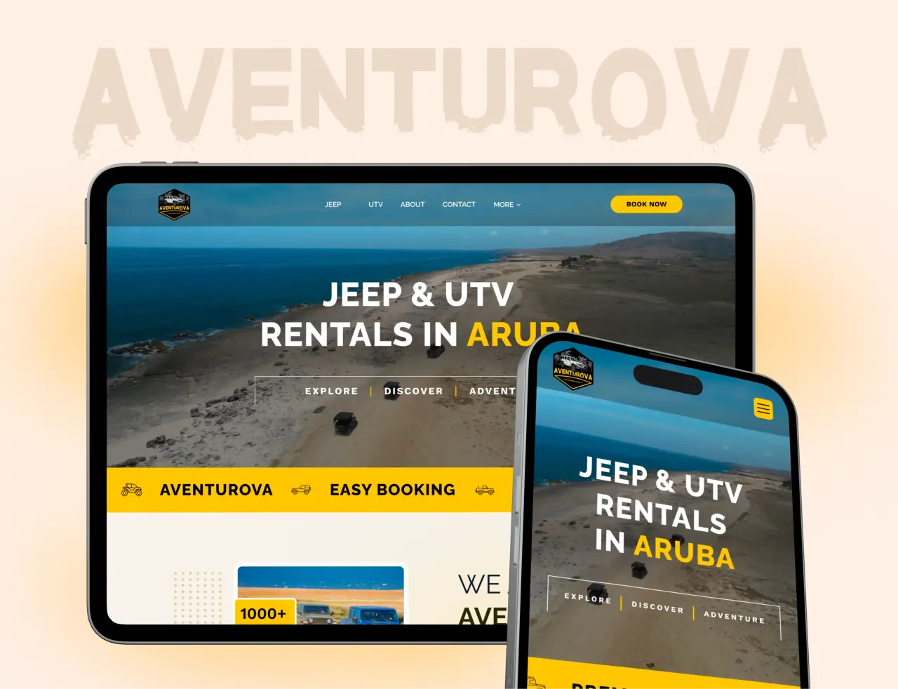
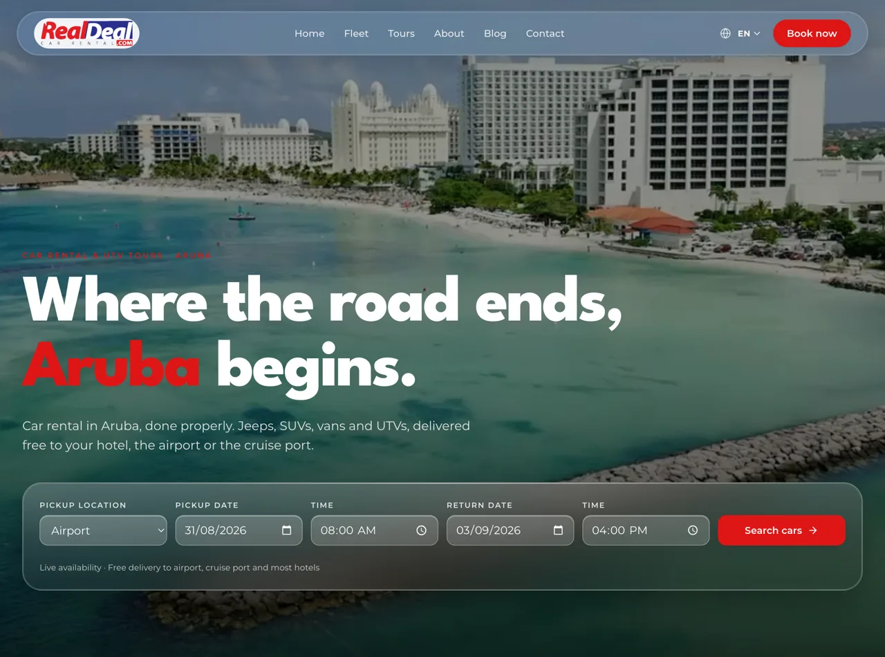
The most common conversion killer is confusion. If a visitor cannot tell within seconds what you offer, who it is for, and what to do next, they leave. A clear headline, an obvious value proposition, and a single prominent call to action beat clever copy every time.
Clarity extends to focus. A page trying to do five things converts worse than one with a single clear goal. Decide what you want the visitor to do, and make that the obvious path.
- Say what you offer in seconds
- One clear, prominent call to action
- One goal per page beats five
Build Trust
People do not buy from sites they do not trust. Reviews, testimonials, recognizable logos, clear contact information, professional design, and transparent pricing all reduce the risk a visitor feels. Trust signals often lift conversion more than any change to the offer itself.
Design quality is itself a trust signal. A polished, fast, professional site tells visitors you are legitimate and careful — a cheap or broken one raises doubt before they even read your pitch.
- Reviews, testimonials, and clear contact info
- Transparent pricing and professional design
- Polish itself signals trust
Remove Friction
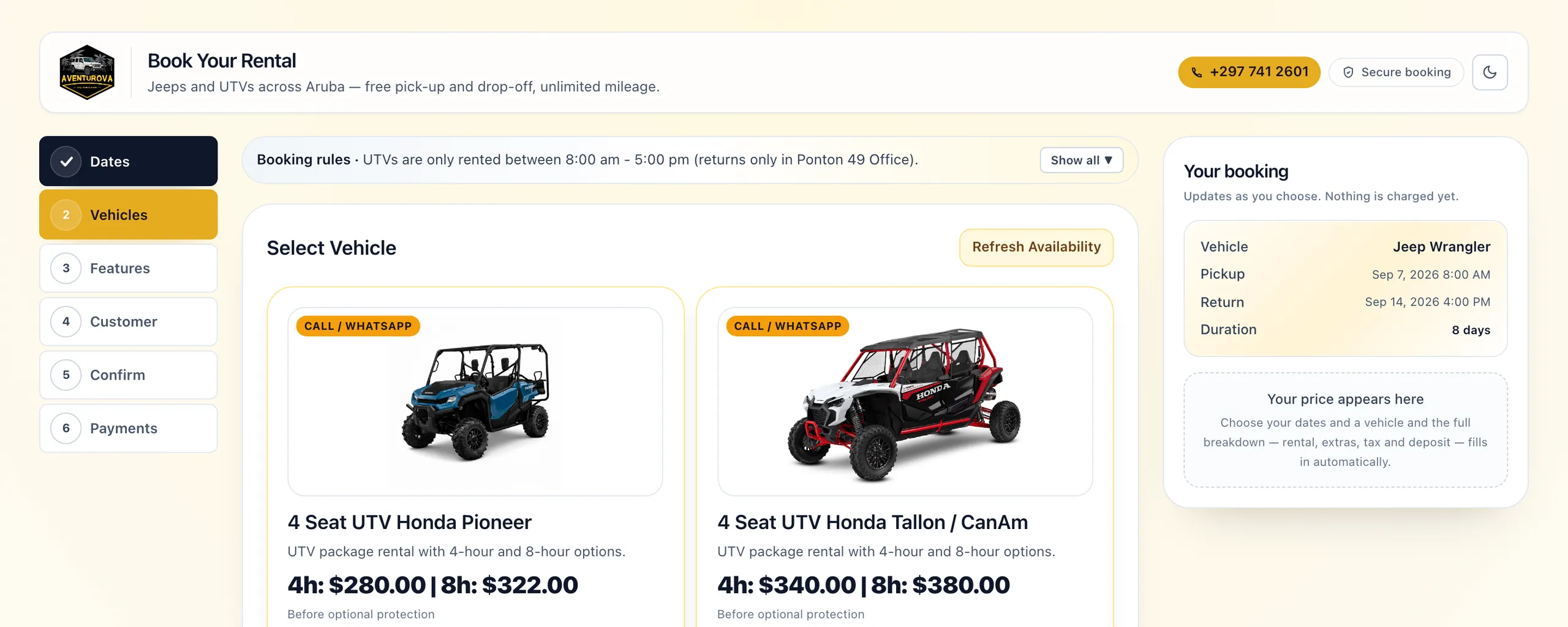
Every extra step, field, or moment of doubt costs conversions. Shorten forms to what you truly need, reduce the clicks to the goal, offer guest checkout, and remove distractions from key pages. Friction is where intent quietly dies.
Look at your funnel for the exact points where people drop off — a long form, a confusing step, a demand for information too early — and remove or simplify them. Small reductions in friction compound into real gains.
- Shorten forms and reduce clicks
- Cut distractions on key pages
- Fix the specific drop-off points
Speed and Mobile
Speed is conversion. Every extra second of load time loses visitors, especially on mobile, where much of your traffic is. A fast site keeps people engaged; a slow one bleeds them before they ever see your offer.
The mobile experience has to be genuinely good, not just functional. Thumb-friendly buttons, readable text, and short forms make converting on a phone easy — and that is where more of your customers are deciding.
- Faster pages convert better
- Most visitors are on mobile
- Thumb-friendly, readable, and short
How NeoDimensional Lifts Conversion
NeoDimensional is a US-based UI/UX design and web development agency, founded by Guljar Hosen. We design and build websites for conversion — clear messaging, strong trust signals, low friction, and fast, mobile-first performance — and can audit and improve an existing site too.
If your traffic is not converting the way it should, we can find why and fix it. Book a call and we will look at your site.
- Conversion-focused design and build
- Clarity, trust, low friction, speed
- Audit and improve existing sites