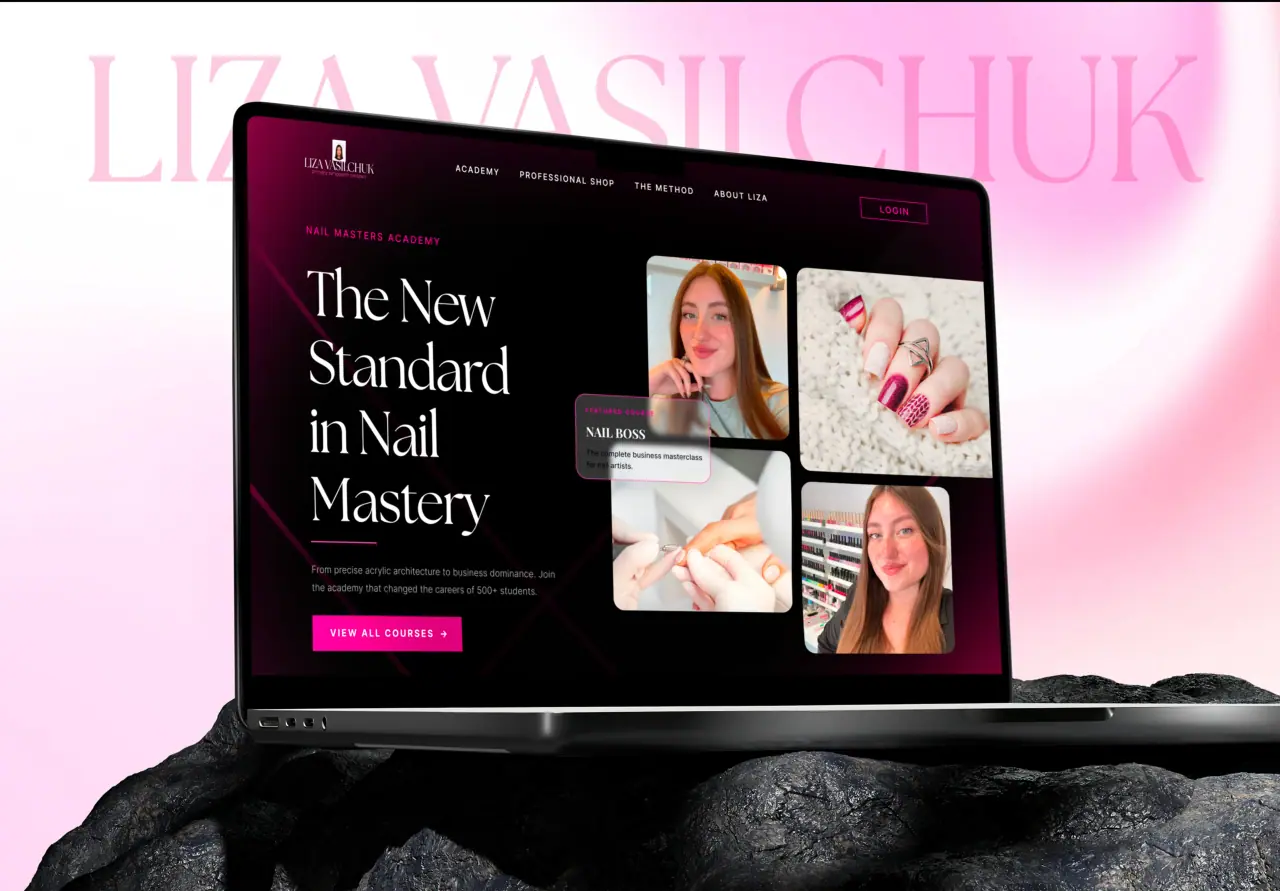






Minimalist web design is not about empty pages — it is about removing everything that does not earn its place, so what remains works harder. Here is why minimalism converts, where it goes wrong, and how to do it well.
Key takeaways
- Minimalism removes clutter so the essential stands out.
- It improves clarity, speed, and focus.
- Done poorly, it becomes empty or unusable.
- Good minimalism is intentional, not just sparse.
What Minimalist Design Really Is
Minimalist web design is the discipline of removing anything that does not serve the user or the goal. It is not about being plain or empty; it is about intention — every element that remains has a reason to be there, and the clutter that distracts has been cut.
The result feels calm and confident. With fewer competing elements, the important things — the message, the content, the call to action — get the attention they deserve.
- Remove what does not serve the goal
- Intentional, not empty
- Let the essential stand out
Why Minimalism Converts
Clutter creates cognitive load — every extra element is one more thing to process, and one more chance to get distracted or confused. Minimalism reduces that load, so users find what they need and act on it faster. Fewer distractions means a clearer path to conversion.
Minimal sites also tend to be faster (less to load) and more focused (one clear action per screen), both of which lift conversion. Less really can do more, when the "less" is chosen carefully.
- Lower cognitive load, faster decisions
- Fewer distractions, clearer path
- Often faster and more focused
Where Minimalism Goes Wrong
Minimalism fails when it removes too much. Stripping away helpful labels, hiding important navigation, or sacrificing clarity for the sake of looking sparse makes a site harder to use, not cleaner. Empty is not the same as minimal.
The other trap is mistaking minimalism for a style to apply rather than a decision to make. Removing things for aesthetics, without asking whether users needed them, can quietly hurt usability. Minimalism serves the user or it is just fashion.
- Do not remove what users need
- Empty and unusable is not minimal
- Serve the user, not just the look
How to Do Minimalism Well
Good minimalism starts from purpose: know what each page must achieve, keep what serves that, and cut the rest. Use whitespace deliberately to group and guide, strong typography to carry the message, and restraint with color so emphasis means something.
Crucially, keep usability intact — clear navigation, obvious actions, readable text. The best minimalist sites feel effortless to use precisely because a lot of careful decisions removed everything that would have gotten in the way.
- Start from each page’s purpose
- Whitespace and typography do the work
- Keep navigation and actions obvious

How NeoDimensional Designs Minimally
NeoDimensional is a US-based UI/UX design and web development agency, founded by Guljar Hosen. Clean, intentional, minimal design is core to how we work — we remove the clutter and let your message and calls to action do their job, without sacrificing usability.
If you want a site that feels calm, clear, and high-converting, that is exactly our style. Book a call and we will show you what minimal-but-effective looks like for your brand.
- Clean, intentional, minimal design
- Clarity and conversion, not just aesthetics
- Usability kept intact