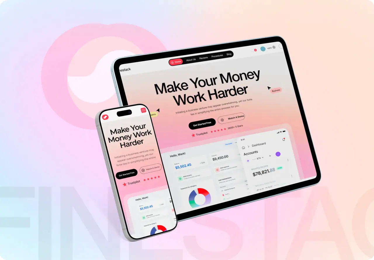






What working with a UI/UX design agency actually looks like, week by week: what you do, what the agency does, what you get at the end of each phase, and the decisions only you can make. If you are choosing an agency rather than preparing to work with one, start with our UI/UX design agency page instead.
Key takeaways
- A focused UI/UX engagement runs five to seven weeks in four phases, each ending with your sign-off.
- Your job is access and decisions: users to talk to, analytics to read, and one person who can say yes.
- Every phase ends with something you can click, not a document you have to imagine.
- The handoff is a design system and developer-ready files, owned by you.
Before the first week
The work starts before the kickoff call. You send what exists: the current product or site, analytics access, any research you already have, the competitors your customers compare you with, and the business goal the project has to move. A signed scope and a fixed price come out of this stage, not a vague estimate.
Pick one decision-maker. Projects slow down when feedback comes from five people who disagree; they move when one person gathers opinions and makes the call.
- Access to the current product and analytics
- Existing research and customer feedback
- The competitors customers compare you with
- One person who can approve each phase
Week one: research and audit
The agency interviews stakeholders and, where possible, real users, reads the analytics you already have, and tears down two or three competitors. The goal is to find where people drop off and why, before anyone draws a screen.
You get a flow map, the audit findings and an agreed scope for the design. Your job this week is to make people available and to confirm the problems the research found are the ones worth solving.
Related: best UI/UX design agencies in the USA.
Weeks two and three: wireframes and a prototype
Low-fidelity screens turn into a clickable prototype you can put in front of users. This is the cheapest moment to change your mind: moving a step in a wireframe takes minutes, moving it after the visual design takes days.
Test it with real people if you can, even five. You sign off the structure and the flows at the end of this phase, and the visual design builds on a structure that has already been checked.
- Clickable prototype, not static images
- Tested with real users where possible
- Structure signed off before visual design
Weeks four to six: high-fidelity UI
Now the screens get their real look: typography, color, components, and every state a screen can be in, including empty, loading, error and first use. This is the longest phase, and the one where a good agency shows you work weekly rather than all at once.
Your feedback here should be about whether the design does its job, not about taste in isolation. Anchor every comment to a user or a goal and the rounds stay short.
Related: our UI/UX design agency service.
The last week: design system and handoff
The components, tokens and documentation become a design system your developers build from, and the files move into your own Figma workspace. A good agency stays available while the build happens, because developers always have questions the files did not answer.
If the same team also builds the product, this step disappears into the build, which is the main reason we design and build in one team.
- Design system with components and tokens
- Files delivered in your own Figma workspace
- Support for developers during the build
What useful feedback looks like
Feedback moves a project when it names a user and a goal: new visitors will not find the pricing link here, or returning customers need the reorder button above the fold. It stalls a project when it names a taste: make it pop, it feels off, can we try blue.
Collect comments from your team, resolve the contradictions on your side, and send one consolidated list per round. Two rounds of clear feedback beat six rounds of scattered opinions every time.
- Name the user and the goal
- Point at the exact screen and state
- Resolve disagreements internally first
- One consolidated list per round
Why UI/UX projects run late
Design rarely makes a project late. Waiting does: waiting for analytics access, for users to interview, for a decision-maker back from holiday, for content nobody was assigned to write. Each wait is small and together they can double a timeline.
Plan them out at the start. Book the review meetings for the whole project on day one, assign the content, and agree who approves what. A project with its calendar agreed up front finishes when it was supposed to.
What it costs and how you pay
Our websites are designed and built for one price: $1,599 for up to five pages and $1,999 for up to eight with a full design system. The price is fixed in writing before work starts, you pay 30% to start, 40% at review and 30% at launch, and every project includes 30 days of fixes after launch.
If you are still comparing agencies, the questions that matter are in our guide to the best UI/UX design agencies in the USA, and the details of our own service are on the UI/UX design page.