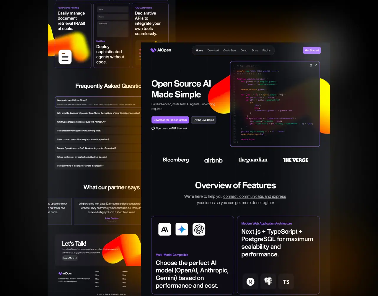





SaaS design is not only about making software look modern. It is about helping users understand the product, reach value quickly, and keep coming back.
Key takeaways
- SaaS UI/UX should focus on activation, retention, and revenue, not only visual polish.
- Onboarding should help users reach one meaningful outcome as quickly as possible.
- Dashboards work best when information is organized by user priority.
- A lightweight design system helps startups move faster without creating product debt.
Why SaaS UX Matters More Than Ever
A SaaS product depends on repeated use. If users feel confused during onboarding, struggle to understand dashboards, or cannot complete core tasks, they are less likely to activate and more likely to churn.
Better SaaS UX creates clarity at each step: what the product does, why it matters, what the user should do next, and how progress is measured.
For startups, this matters because early product experience affects trials, demos, retention, investor perception, and support workload.
- Reduce confusion during onboarding and first use
- Help users reach value faster
- Support retention through predictable product patterns
Designing the Activation Path
Activation is the moment when a user experiences meaningful value. For a finance dashboard, that may be connecting an account and seeing useful insights. For a project tool, it may be inviting a teammate and completing the first workflow.
A UX agency should map the activation path before designing screens. What does the user need to do first? What can be delayed? What should be explained inside the interface instead of a help article?
Every SaaS screen should support progress. If a step does not help users reach value, trust the product, or make an informed decision, it may be adding cognitive load.
Related: SaaS development for startups.
- Define the first meaningful product outcome
- Remove unnecessary steps from early setup
- Use progress cues, defaults, and contextual guidance
SaaS Dashboard Design Principles
Dashboards often become cluttered because teams try to show everything at once. A stronger approach is to organize information by user priority.
Start with the most important status, next action, or insight, then allow users to drill down for detail. Use cards, filters, tabs, empty states, and progressive disclosure carefully.
Data visualization should be useful, not decorative. Charts need labels, context, time ranges, tooltips, and action-oriented interpretation.
- Prioritize the most important insight or next action
- Use empty states to guide new users
- Make charts explain what changed and why it matters
Onboarding UX That Reduces Drop-Off
SaaS onboarding should ask for the minimum information needed to create value. Long forms, unclear setup steps, and forced tutorials can create early abandonment.
Effective onboarding includes role-based setup, checklists, sample data, helpful defaults, contextual tips, and follow-up emails that match in-product behavior.
The goal is not to teach every feature. The goal is to help users complete one meaningful outcome.
- Ask for less information at the beginning
- Use checklists, sample data, and helpful defaults
- Guide users to one meaningful outcome before deeper exploration
Design Systems for Faster SaaS Growth
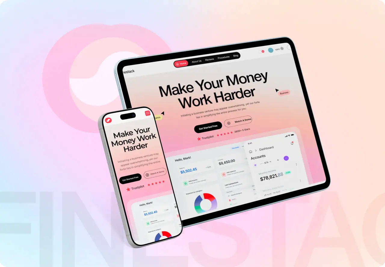
A design system gives a SaaS team reusable components, visual consistency, and faster production. Buttons, forms, modals, tables, alerts, navigation, cards, and typography should not be redesigned from scratch every sprint.
For startups, the system does not need to be massive at first. It needs to be organized, practical, and aligned with engineering.
NeoDimensional LLC helps startup teams turn product ideas into organized flows, polished interfaces, and developer-ready systems that can scale after launch.
- Reusable components reduce design and engineering debt
- Consistent patterns make the product feel more mature
- Figma components should match front-end components where possible