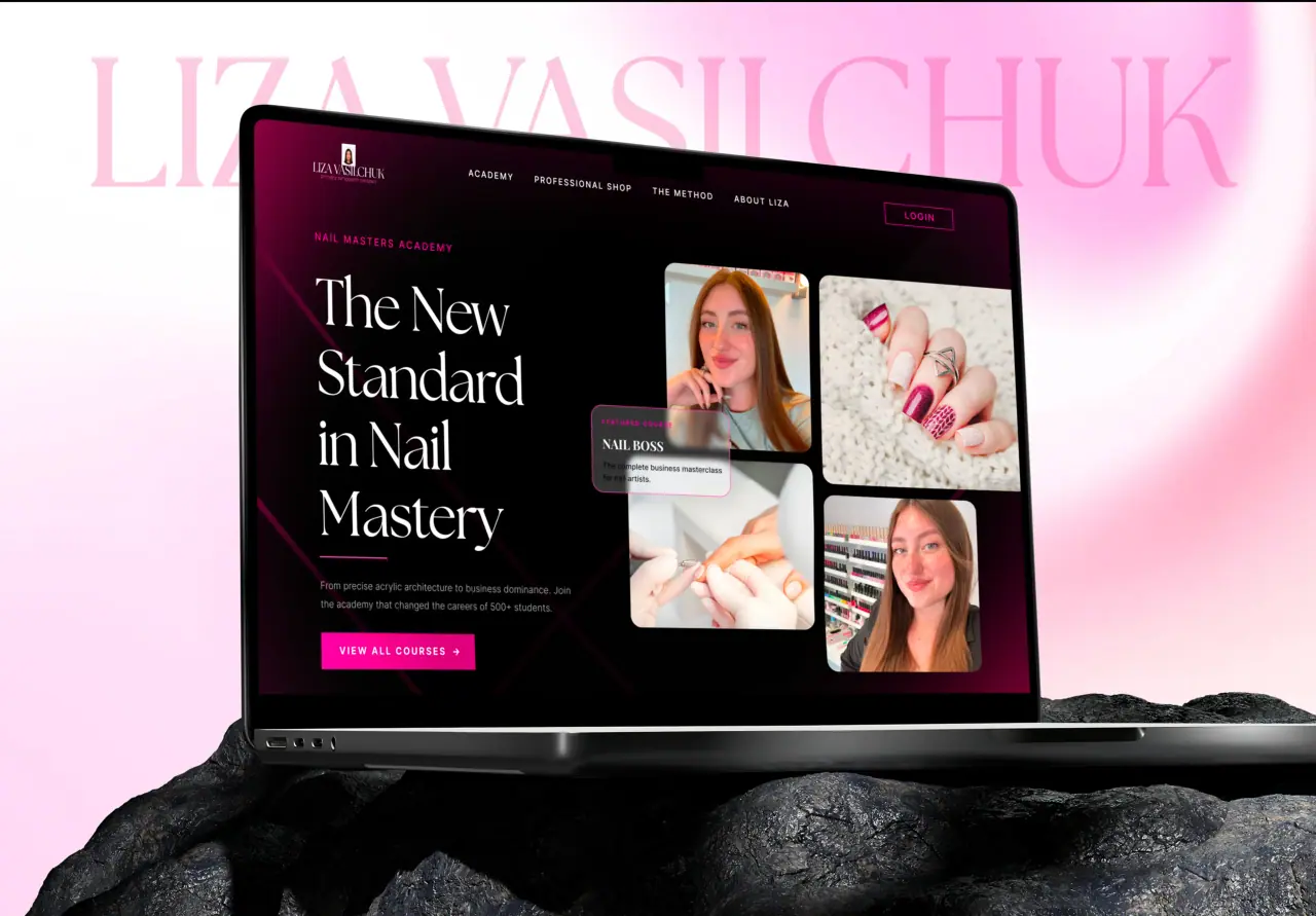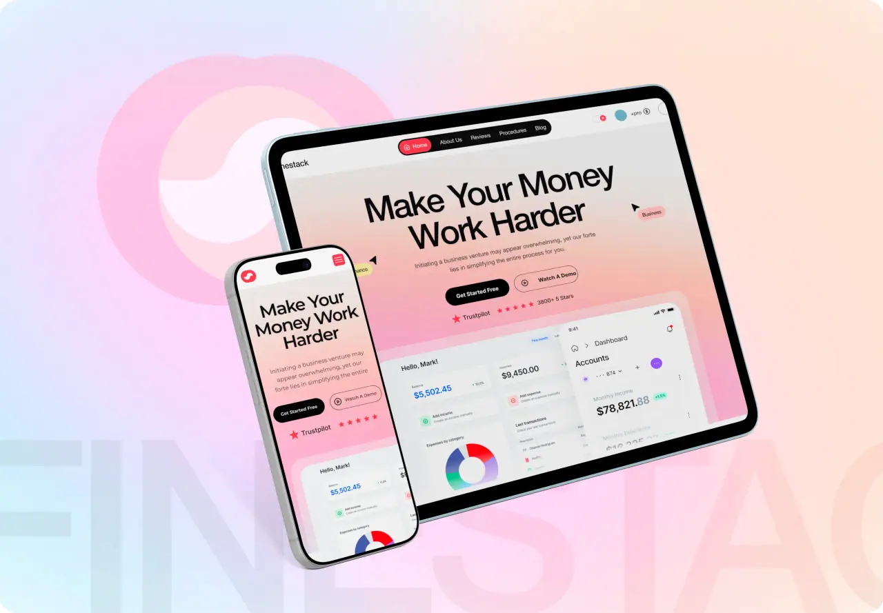






The difference between a product that feels cheap and one that feels polished often comes down to tiny details — a button that responds, a smooth transition, a helpful little animation. These are micro-interactions. Here is how to use them well.
Key takeaways
- Micro-interactions are small responses to user actions.
- They provide feedback, guidance, and a sense of polish.
- Good ones are subtle and functional, not decorative.
- Overdone, they distract more than they help.
What Micro-interactions Are
Micro-interactions are the small moments where a product responds to a user — a button that depresses when clicked, a toggle that slides, a subtle loading animation, a checkmark that confirms an action. Each is tiny, but together they make an interface feel responsive and alive.
They are not big features; they are the finishing touches on ordinary actions. And precisely because they are everywhere, they shape the overall feel of a product more than any single flashy animation.
- Small responses to user actions
- Button states, toggles, confirmations
- Tiny individually, defining collectively
Why They Matter
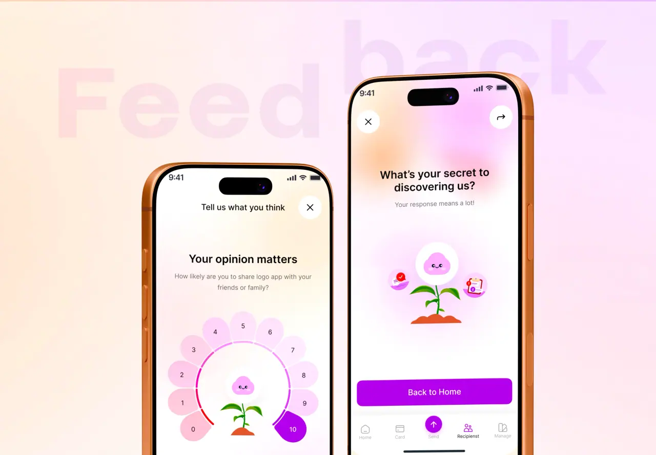
Micro-interactions do real work. They give feedback (this button registered your click), communicate state (this is loading, this succeeded), and guide attention. Without them, interfaces feel dead and uncertain — did that click do anything? Should I wait?
They also create delight and signal craft. A product that responds smoothly to your touches feels considered and trustworthy. That perception of quality influences whether people enjoy using it and whether they come back.
- Provide feedback and communicate state
- Reduce uncertainty
- Signal craft and build trust
Where to Use Them
The highest-value places are wherever a user takes an action or waits: button and link states, form validation, toggles and switches, loading and progress, success and error confirmations, and transitions between views. These are the moments people need reassurance that something is happening.
The best micro-interactions answer a silent question the user has — "did that work?", "is it loading?", "where did that go?" — right when they ask it. That is where a small animation earns its place.
- Buttons, forms, toggles, loading, confirmations
- Transitions between views
- Answer the user’s silent question
Keeping Them Purposeful
Micro-interactions go wrong when they become decoration — animations that are too slow, too flashy, or everywhere, which makes a product feel gimmicky and slows people down. The best ones are quick, subtle, and there for a reason.
A good test: does this help the user understand or feel something useful, or is it just showing off? If it slows a frequent action or draws attention it does not deserve, cut it. Purpose over spectacle, always.
- Quick and subtle, not flashy
- Every one should have a purpose
- Cut anything that slows or distracts
How NeoDimensional Designs Them
NeoDimensional is a US-based UI/UX design and software development agency, founded by Guljar Hosen. We design and build purposeful micro-interactions — responsive states, clear feedback, and smooth transitions — so your product feels polished and alive without getting in the way.
If your product feels flat or unresponsive, thoughtful micro-interactions can transform how it feels. Book a call and we will show you where they would help.
- Responsive states and clear feedback
- Smooth, subtle transitions
- Polish that never gets in the way