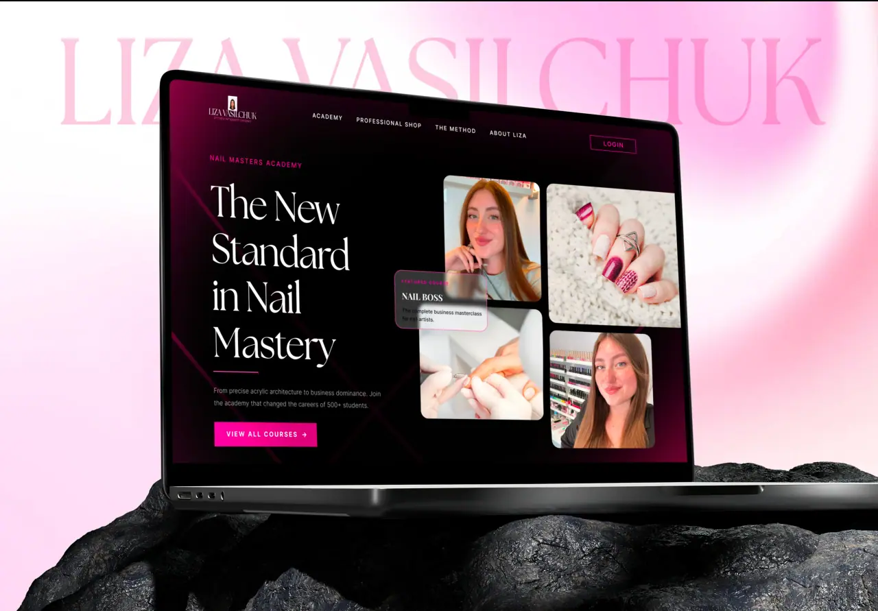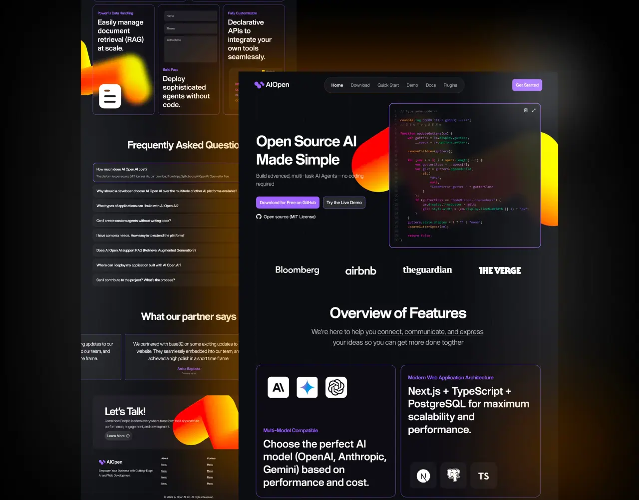





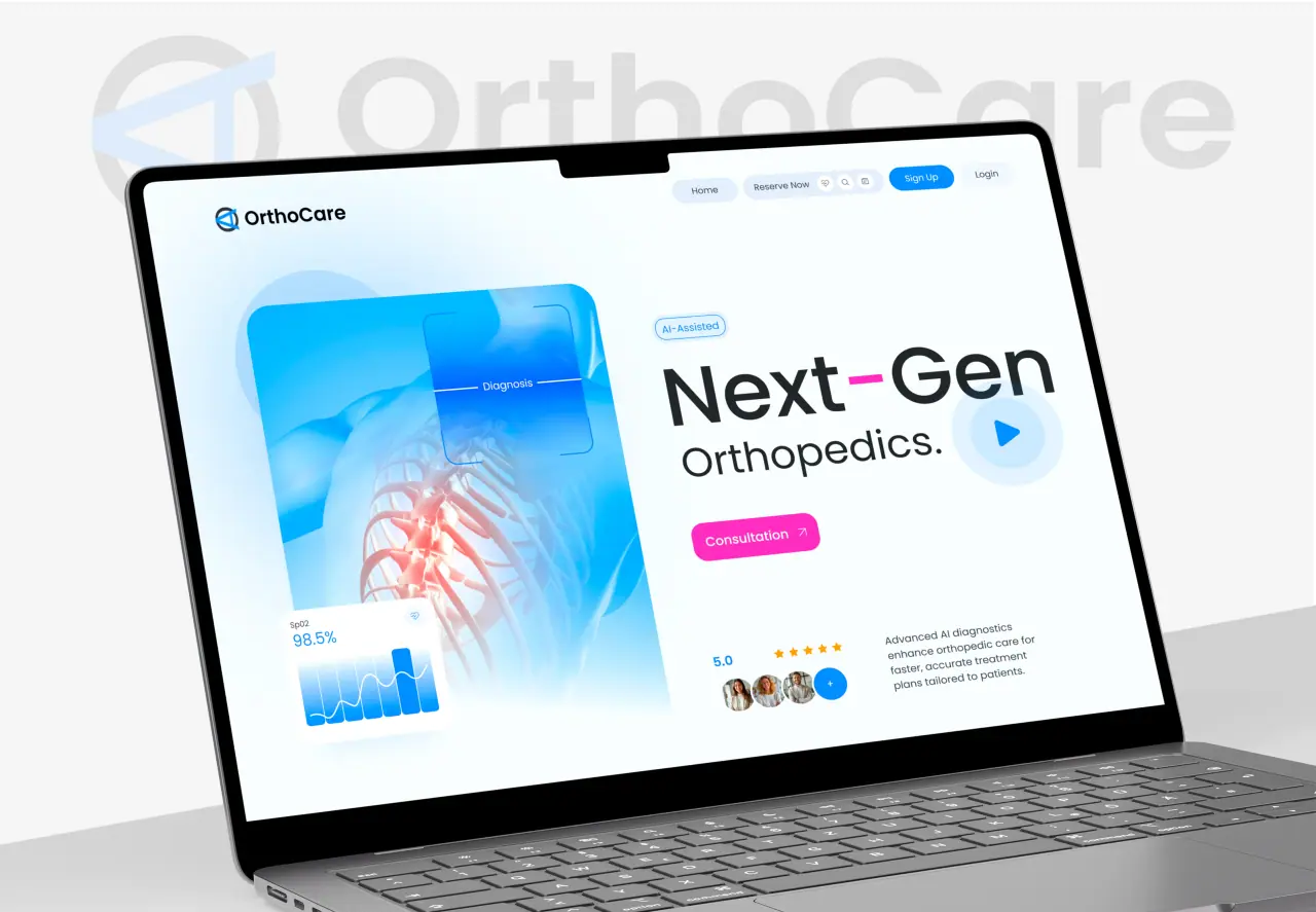
Most of a website is words, which makes typography one of the most important design decisions you make. Good type is clear and almost invisible; bad type quietly makes everything harder to read. Here is how to use type well.
Key takeaways
- Most of the web is text, so typography is central.
- Readability matters more than personality.
- Hierarchy, size, and spacing carry the experience.
- A little restraint goes a long way.
Why Typography Matters
Typography is how your words look and, more importantly, how easily they can be read. Since text is most of what a website communicates, type quality directly affects comprehension, trust, and how professional the site feels. Great type is felt more than noticed.
It also sets tone. The same message reads differently in a crisp modern sans-serif versus a classic serif. Type is where content and design meet, which makes it worth real attention rather than a last-minute font pick.
- Type quality affects reading and trust
- Text is most of what a site says
- Type sets tone as well as legibility
Choosing Fonts
You rarely need more than two typefaces — often one is enough, using its weights for variety. Choose fonts that are highly legible at the sizes you will actually use, that fit the brand’s tone, and that perform well (web-optimized, not heavy files that slow the page).
Prioritize function over novelty. A distinctive display font can work for a big headline, but body text should be chosen for comfort over long reading. When a font choice makes people work to read, it has failed, however stylish it looks.
- One or two typefaces is usually enough
- Legible, on-brand, and web-optimized
- Function over novelty for body text
The Fundamentals of Readable Type
Readability comes from a few fundamentals: a comfortable body size (bigger than most people expect), generous line spacing, line lengths that are not too wide, and clear contrast against the background. These unglamorous details do most of the work.
Hierarchy ties it together — distinct sizes and weights for headings, subheadings, and body so the eye can scan and understand structure at a glance. Consistent, well-spaced hierarchy is what makes long content feel easy.
- Comfortable size, spacing, and line length
- Strong contrast for readability
- Clear, consistent hierarchy
Common Typography Mistakes
The usual offenders: body text too small, lines too long or cramped together, too many fonts and sizes creating visual noise, and low contrast chosen for aesthetics. Each quietly raises the effort of reading, and readers feel it even if they cannot name it.
The fix is almost always simplification and generosity: fewer fonts, larger body text, more spacing, clearer hierarchy. Typography rewards restraint more than cleverness.
- Body text too small or cramped
- Too many fonts and sizes
- Fix with simplicity and generous spacing
How NeoDimensional Handles Type
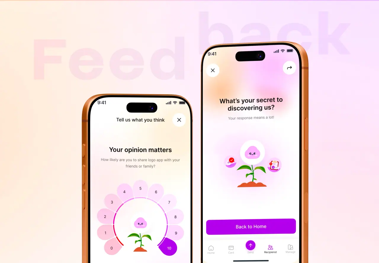
NeoDimensional is a US-based UI/UX design and web development agency, founded by Guljar Hosen. We treat typography as core design — legible fonts, comfortable sizing and spacing, and clear hierarchy — so your content is easy and pleasant to read on every device.
If your site is hard to read or the type feels off, we can fix it. Book a call and we will take a look.
- Legible fonts and comfortable sizing
- Clear, consistent hierarchy
- Readable on every device